
Discovery Workshops
Identifying Opportunities
Facilitated cross-functional alignment to transform ambiguous business ideas into validated product roadmaps.
“Facilitated back end database migration for Web and Mobile apps to Flutter flow, unifying the digital assets for the platforms
Why Discovery? Bridging the Clarity Gap
Clients often come to us with a powerful business problem and a highly specific project lens. They have a deep understanding of their immediate goals, but in the rush to scale, the path forward can sometimes feel fragmented. Business teams, technical leads, and end-users aren't always looking at the same map.
Discovery honors a client’s ambition while ensuring their investment is "future-proofed." It’s about taking that initial spark and giving it the structural integrity it needs to grow.
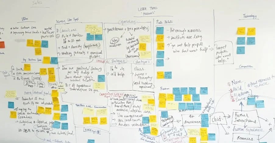
We led paid, collaborative intensives to "de-risk" the project before a single line of code was written. The sessions ran for 2-3 days, working alongside stakeholders, engineerings, product and sales.
The ‘Aha!’ moment : from Ambiguity to Alignment
When a stakeholder sees their complex business logic transformed into a simple, intuitive user flow for the first time. It’s the moment a project shifts from a daunting challenge into a clear, actionable solution
We led paid, collaborative intensives to "de-risk" the project before a single line of code was written. The sessions ran for 2-3 days, working alongside stakeholders, engineerings, product and sales.
Solution
Immediate stability and a strategic roadmap for a cohesive future.
We provided screen-specific resolutions for UX updates following the design audit, categorizing them into 'Must-Have’s' and 'Nice-to-Have’s'.
Proposed incremental improvements to various features that will directly enhance the user experience without altering the overall visual aesthetic.
Design Process : Strategy, Audit, and Unification
Our approach was to systematically dismantle the client’s "lift-and-shift" mandate, using data-backed audits and competitive intelligence to build a case for strategic redesign.
Design Benchmarking :
We began with a competitive analysis of major credit card platforms to showcase the necessary distinction between web and mobile features. This provided the insights needed to advocate for a unified, modern experience rather than a simple migration.
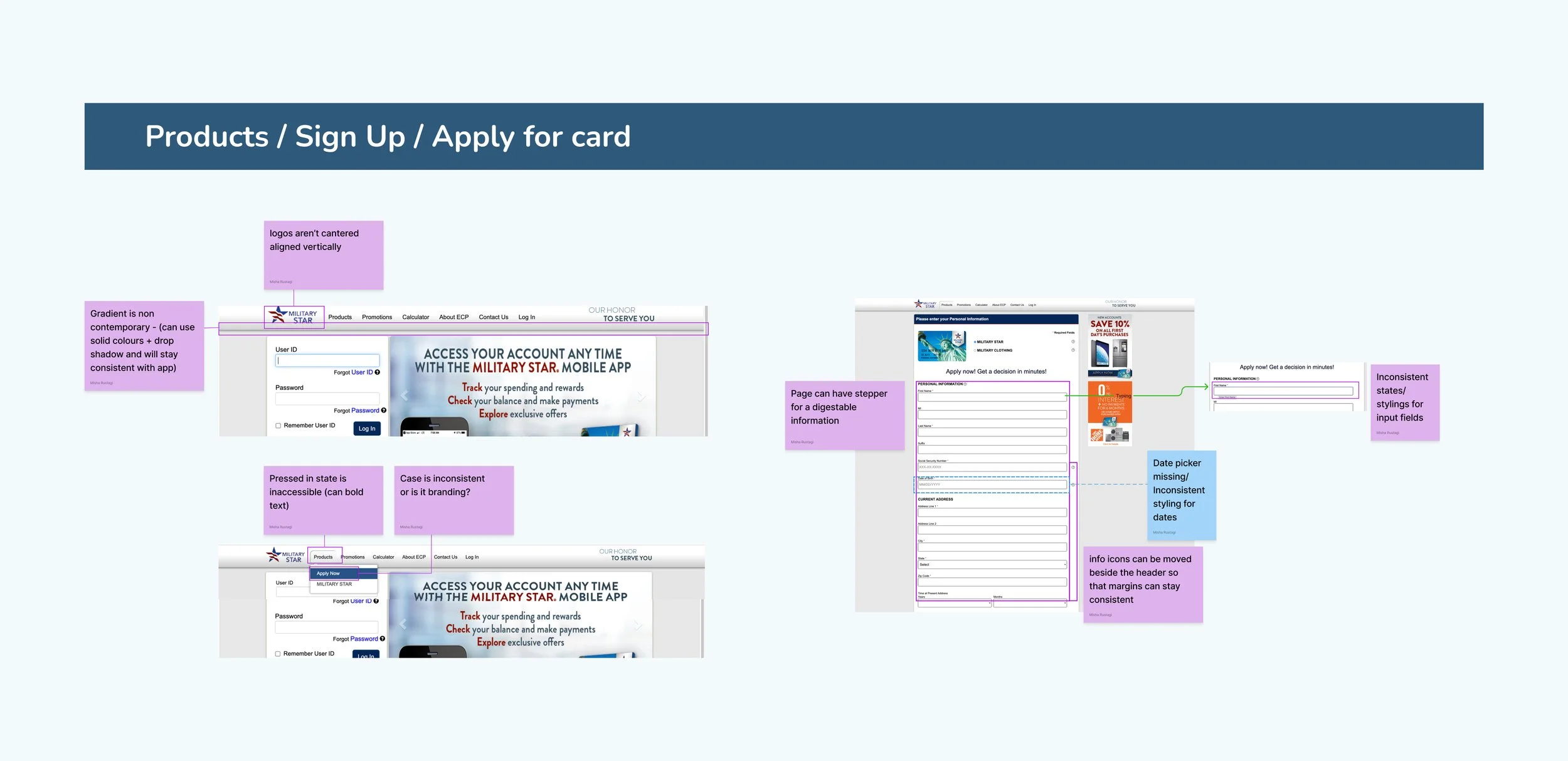
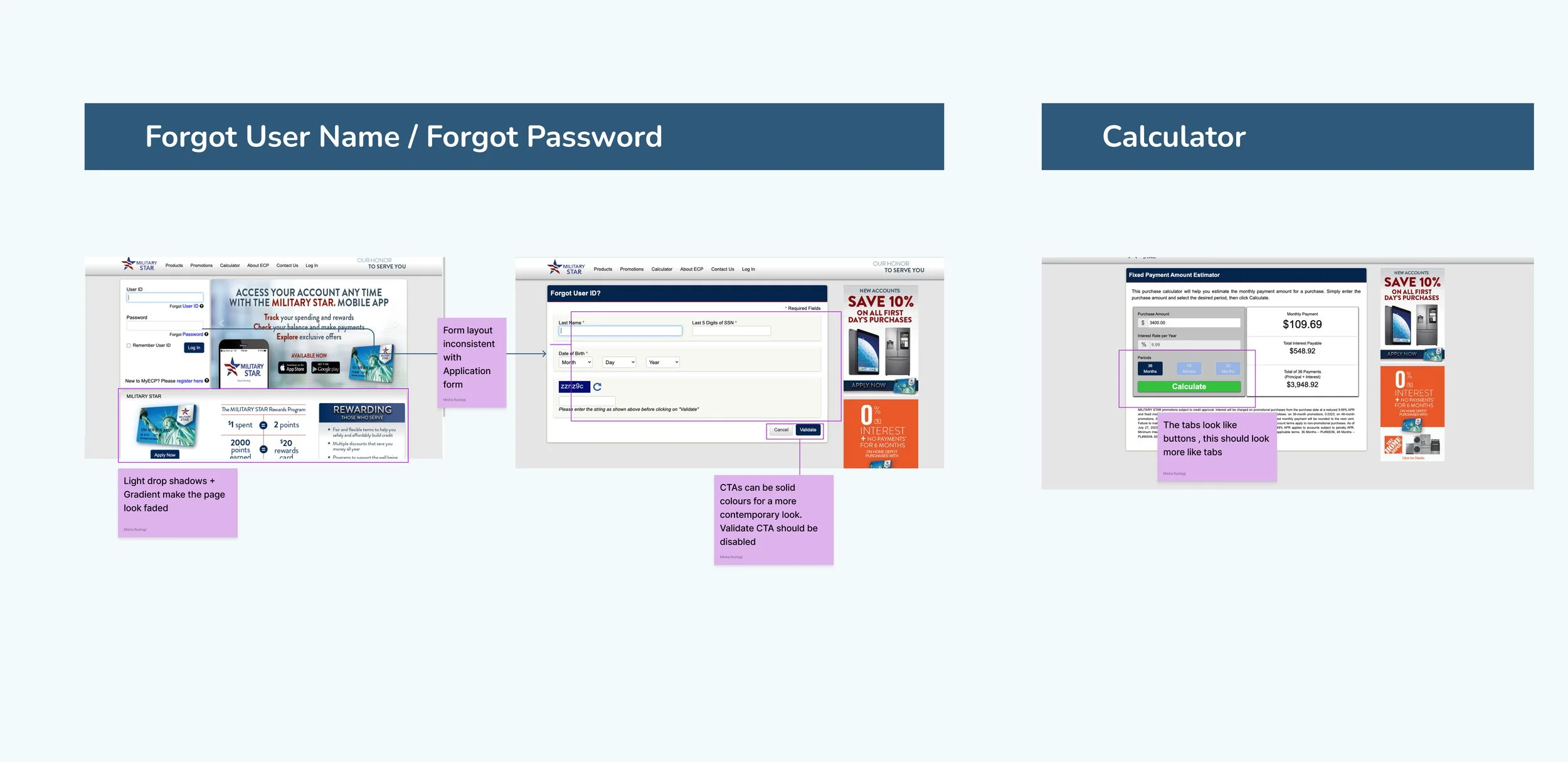
Design Audit
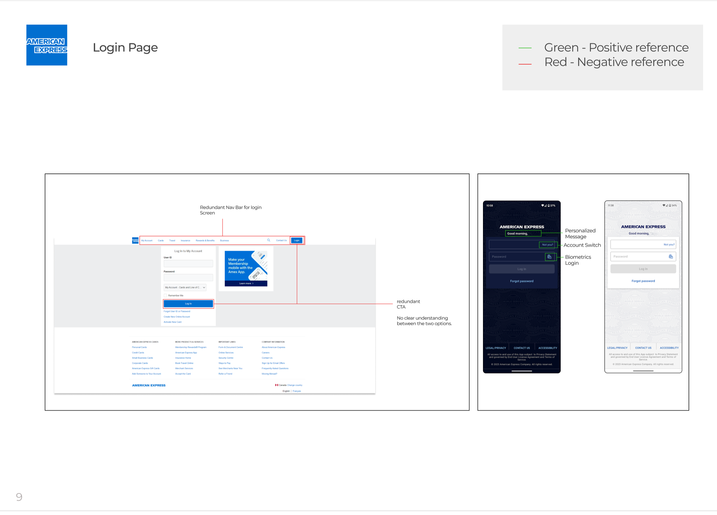
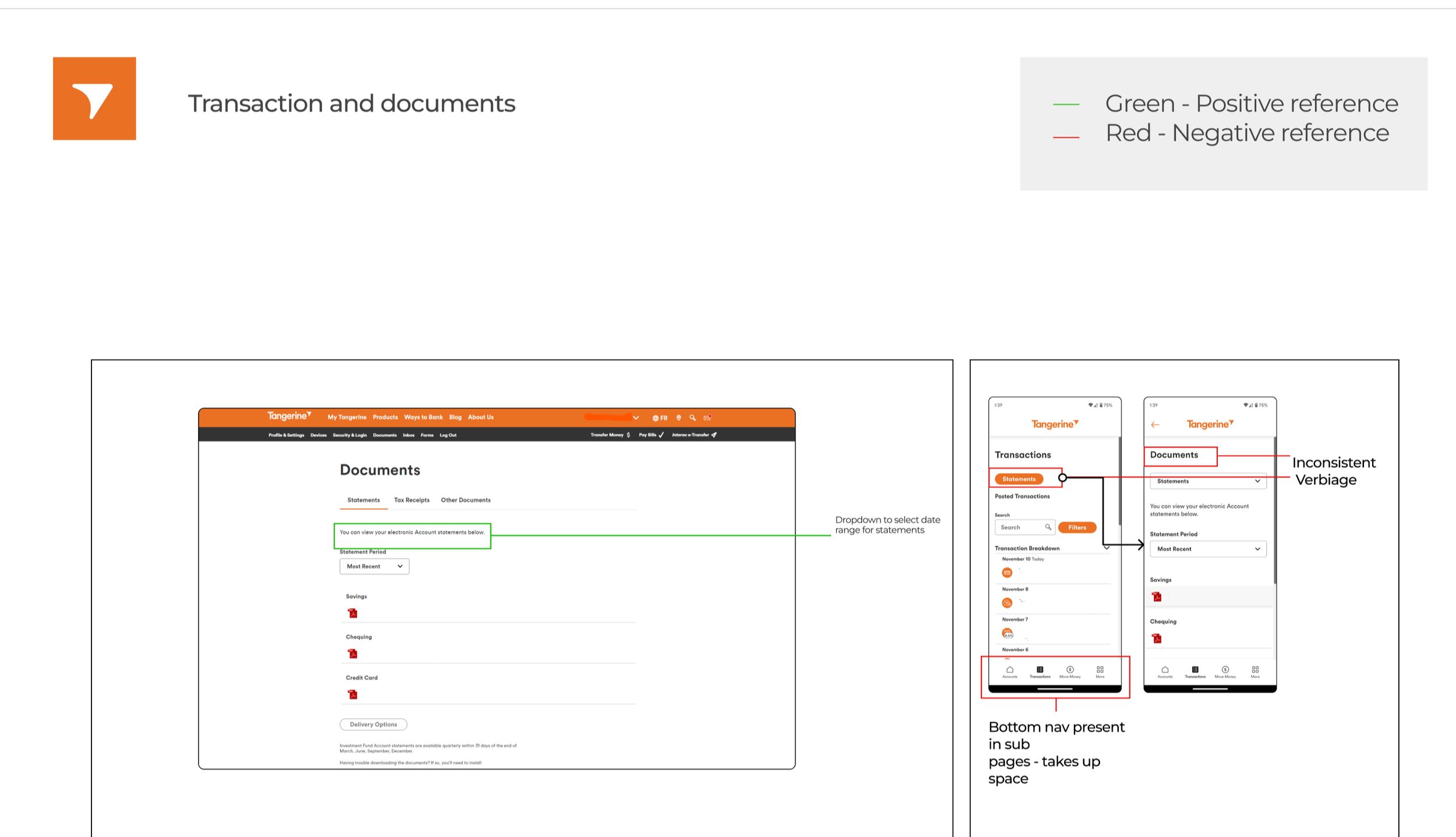
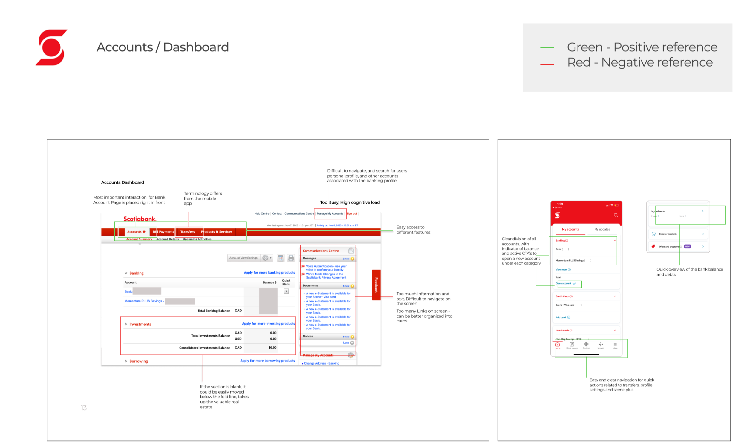
We conducted a comprehensive design audit and benchmarking to identify gaps and inconsistencies between the mobile app and responsive web app. Due to restricted access and confidentiality, obtaining screens with actual data was challenging, leading to multiple back-and-forths.
Here are the findings from the audit:

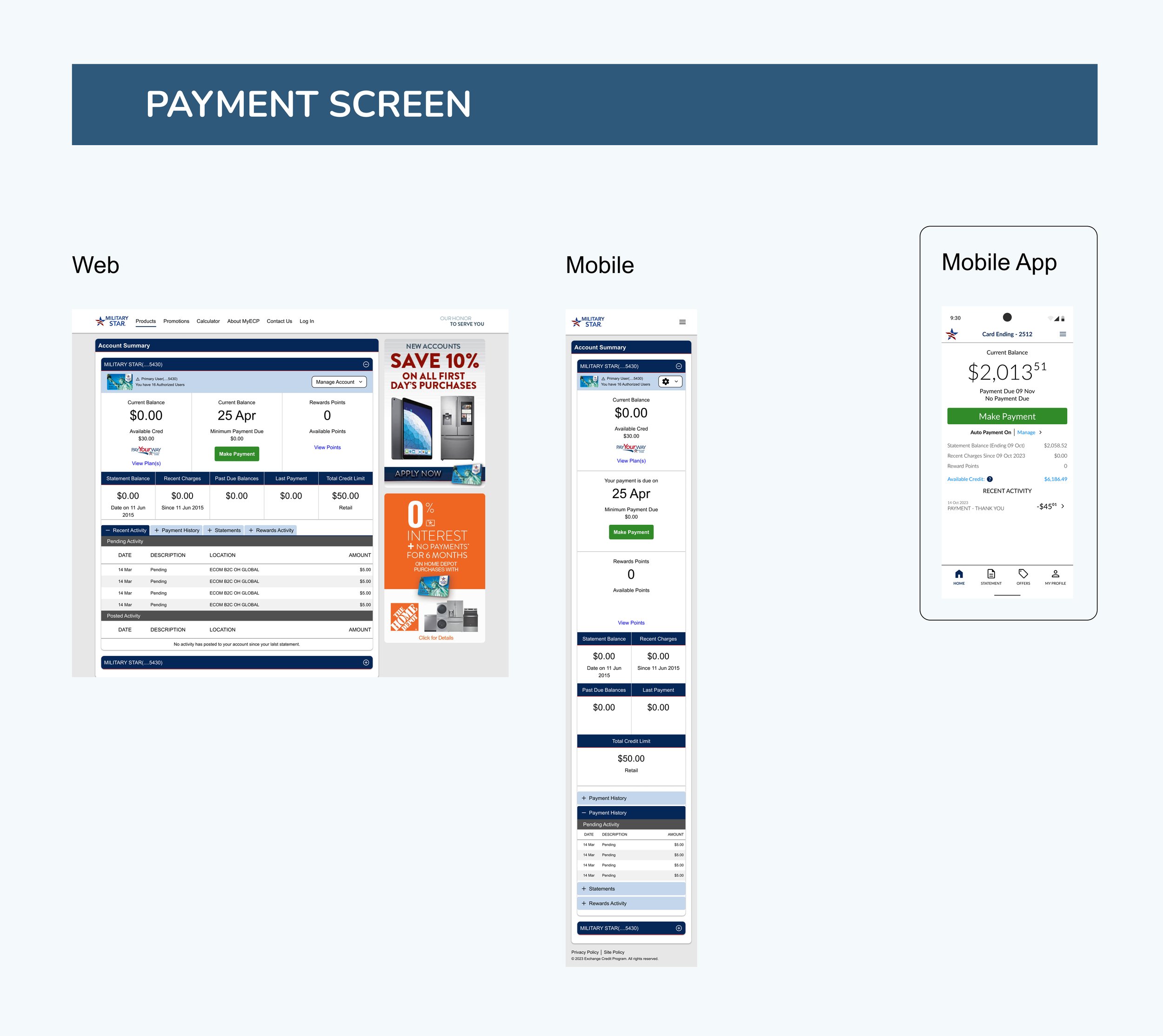
UX Findings
Inconsistent Design elements across Web app and Mobile app
Lack of Show Password Feature
Requires a redesign of information and content hierarchy.
Distracting persistent notification tabs
Missing Success and Active States
Lack of adherence of law of proximity principle
UI Findings
Inconsistent styling of UI Elements like CTA, Toggle buttons, input field etc
Variable CTA Placement
Tight Information Layout impacting readability
Inconsistent Font and Visual Hierarchy
Inconsistent Success and Error Colors
Strategic Redesign & Defense
We executed a strategic redesign, using our audit findings as the blueprint to close critical UX gaps and achieve visual consistency. To efficiently manage tight deadlines and regulatory constraints, we established a sharp 'Must-Have' prioritization list, successfully defending every data-backed decision to secure approval for faster, high-impact delivery.


Design System
To achieve design consistency across the Mobile App & website within a tight timeframe, our team leveraged the Material Design system. This pre-built library provided a foundation of reusable components like navigation drawers, toggles, and buttons, which we then customized to align with Military star’s guidelines. This approach not only ensured a cohesive user experience but also accelerated the development process.

Schedule One Time Payment
The feature allows users to schedule one-time payments on both platforms. Users can select from two bank accounts, choose a payment date, and set the amount. We redesigned the screen by improving the original layout from screenshots, enhancing button hierarchy, accessibility, and content organization.
For Website, We designed responsive screens - For web, Tablet and mobile resolution.

Success Screen
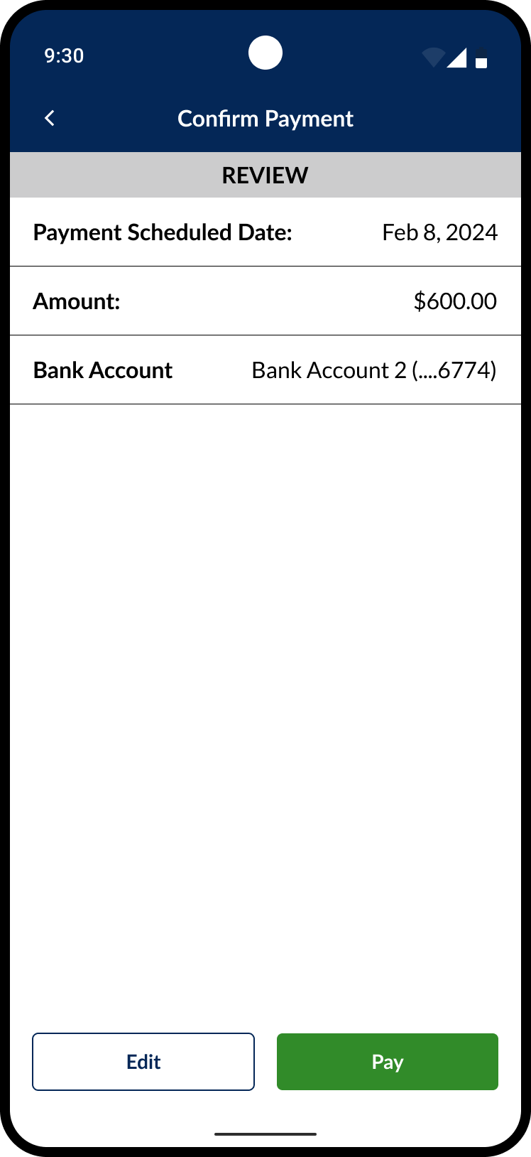

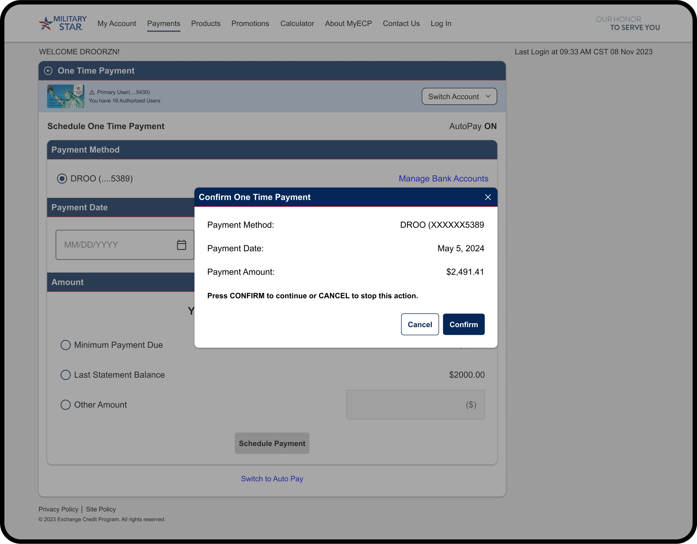
Confirmation Popup
Mobile App- One time payment screens

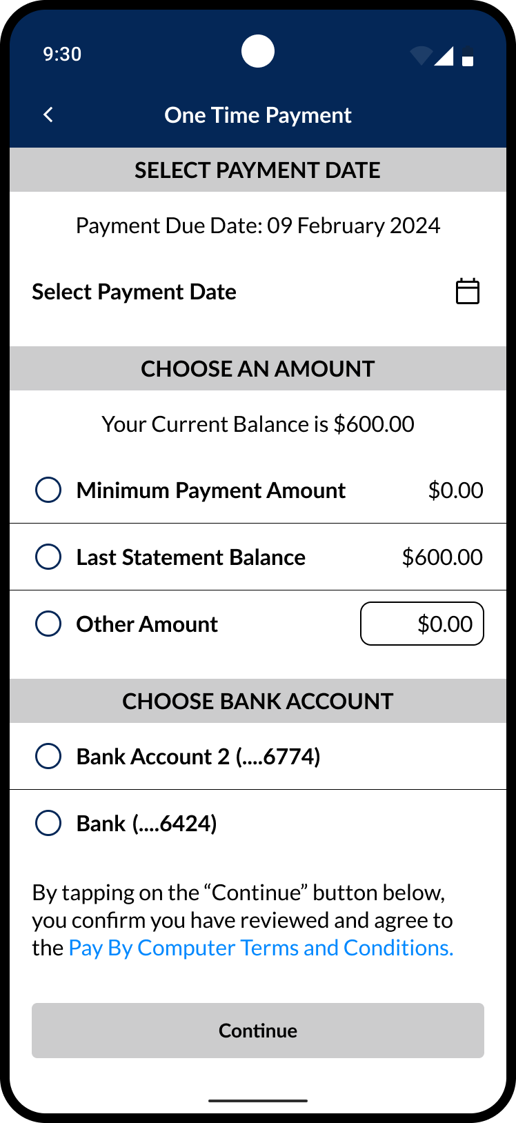

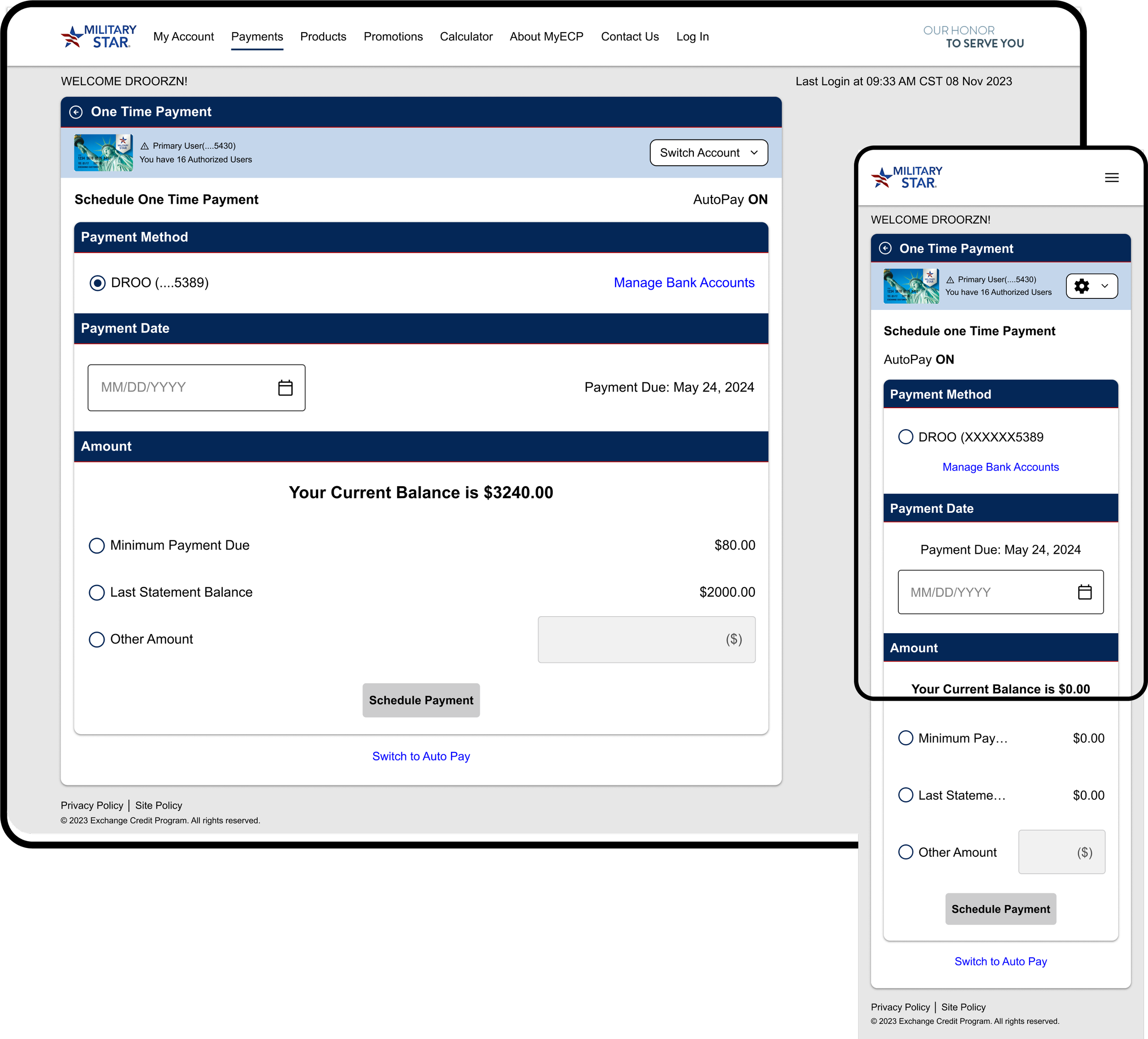
One time payment
Development Handoff & Reviews
The development handoff was done via Figma Dev Mode, ensuring a smooth and efficient transition of the design to the developers.
The process followed a sprint-based approach where we worked closely with the development team, ensuring clear communication and proper documentation to avoid any misalignment. Key steps and consideration include:

Collaborative Walkthroughs: For each sprint, we held walkthroughs with developers to explain the design and address any questions, ensuring clear communication and a shared understanding.
File Hygiene & Organization:
We maintained a clean, well-structured Figma file with properly named layers and components.
The file was divided into sprint-based sections, with flows and components color-coded to simplify navigation and promote focus.
Each version was saved and labeled for clarity, ensuring developers had the latest design
Detailed Annotations:
Specific interactions (hover, selected, swipe) were annotated to provide developers with clear guidance on various user behaviors and conditions.
Screen Linking with Figma Autoflow:
Screens were linked to show navigation and interactions, helping developers understand the app’s flow and facilitating quick prototyping.
Demo Sessions & Feedback:
We attended developer-led demos to ensure design consistency, providing feedback on any visual or experiential discrepancies to refine the final product.
Our Impact
The project initially began with a straightforward "lift and shift" approach, migrating the original mobile and web platforms to Flutter Flow. However, despite its apparent simplicity, the client overlooked several critical nuances that we highlighted throughout the process.
Our intervention and constant explanation of the decisions we made during the redesign created the following impact :
Enhanced User Experience: We addressed the gaps identified during the audit and created a more intuitive experience across both platforms. This streamlined navigation for users and contributed to a notable decrease in drop-off rates.
Unified Features and Functionality: The original platforms exhibited significant differences in visual components, verbiage (UX copy), and overall experience. We successfully identified and resolved these inconsistencies, resulting in a more cohesive user experience across both platforms.
Consistent Visual Elements and Branding: We observed discrepancies in iconography and branding across the platforms. By leveraging Material Design principles and securing necessary approvals, we established a consistent design language for both Platforms
Prioritization of Features: Given the tight timeline for the Phase 1 release, we collaborated to create a "must-have" and "nice-to-have" feature list for future expansion. This helped establish a clear roadmap for the platform's ongoing development.