RISE: Health Care Social Media Platform
Mobile App . Wireframes . Dev Handoff
Conceptualized and designed Healthcare social media platform that caters to peer driven community.
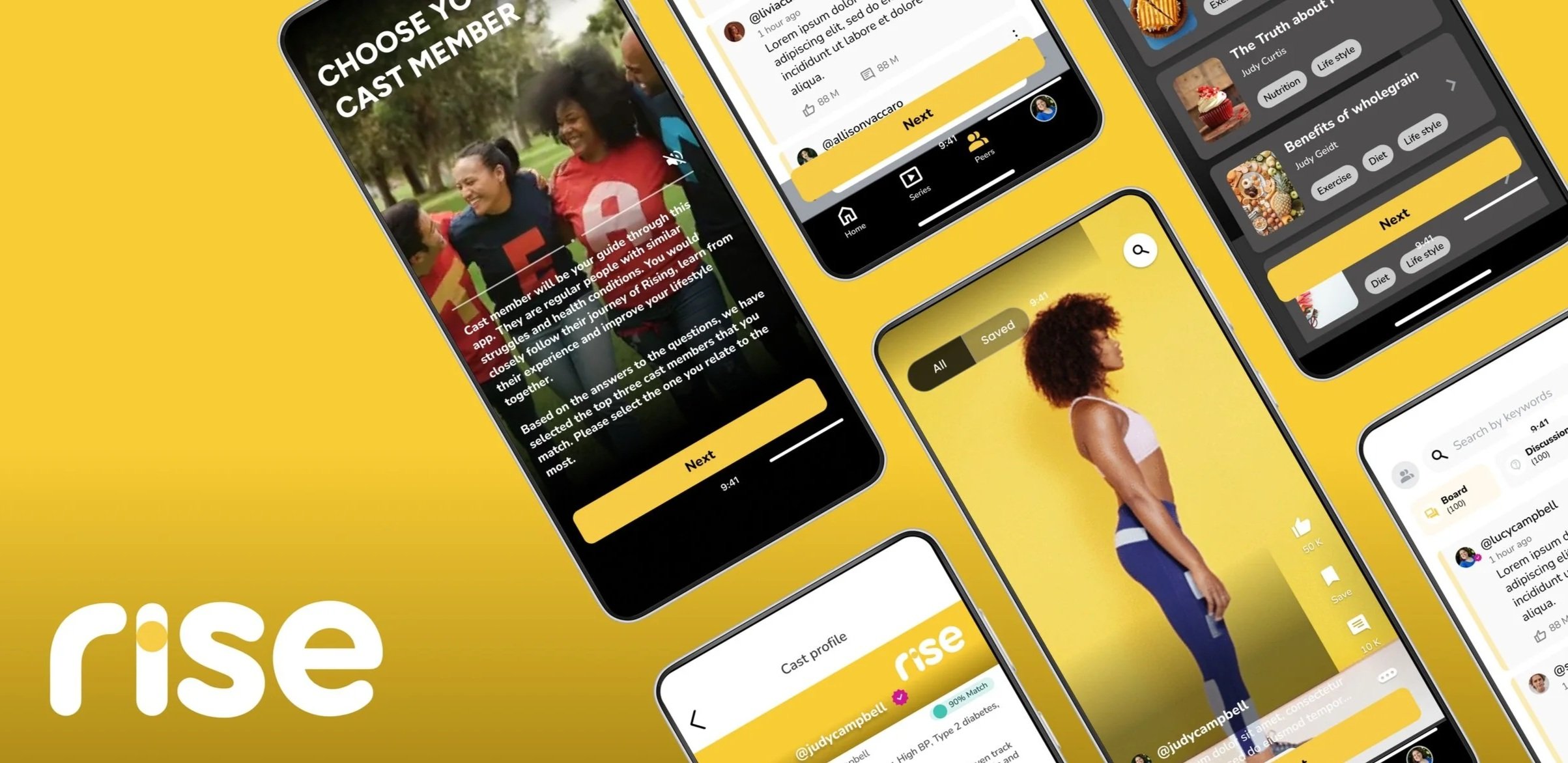
First lifestyle medicine social health platform that curates a connected, personalized health experience inside a peer- driven community.
It takes an infotainment approach, Docu-series featuring 15 cast members, that teaches, equips, and inspires users through each step.
Bennett Ranville & Bdeir
Client
User Experience Designer
My Role
UI Designer, Design Lead, PO
Team
Native Mobile App
Platform
20 Weeks
Duration
Project’s Objective
Problem Statement
The client arrived with concept screens for a social-learning app—complete with tiered video lessons and a quirky “diet ID” that promises to pair you with the right peers. But beyond the visuals, nothing else was set in stone.
Our challenge was to take this energetic-but-undefined idea and shape it into a polished, purposeful MVP. We needed to pinpoint the must-have features, carve out a clear journey, and design an experience where users don’t just binge a docuseries-style curriculum—they feel like they’re stepping into a community storyline.
The goal : Make learning feel addictive, personalized, and socially magnetic.
The strategic objective was to architect a behavioral health ecosystem that converts passive health content into active lifestyle transformation. My role was to define a scalable framework where clinical data (Diet ID) and social motivation (The Docuseries) converge to drive long-term user retention and measurable health outcomes.
We designed a hybrid mobile app with an admin panel, focusing on personalization and engagement through gamification, infotainment-style lessons, and social media–inspired scrolling.
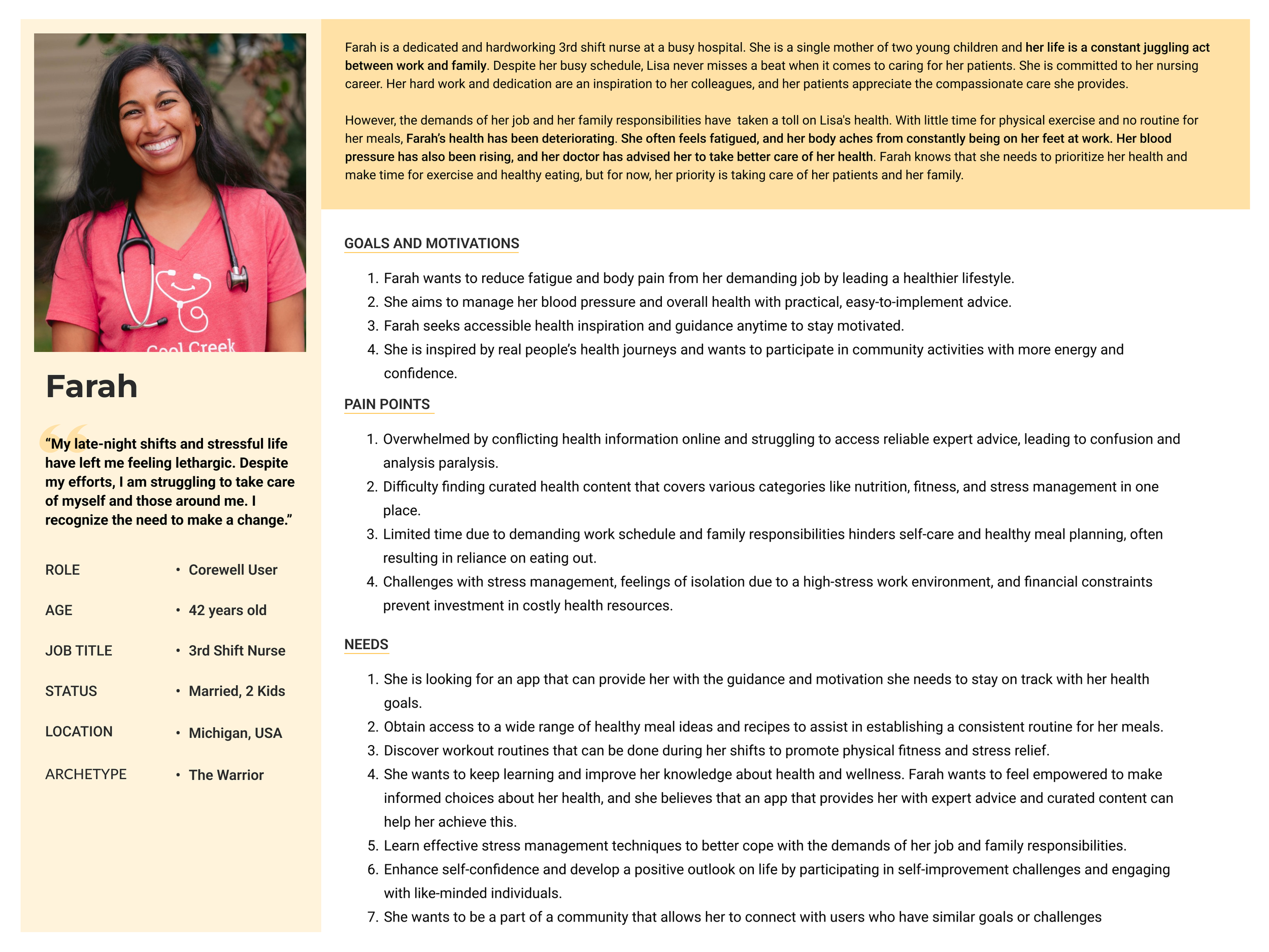
“Healthcare employees often feel stressed and overwhelmed when managing their own lifestyle, diet, and health due to limited knowledge and experience. They need guidance and support throughout their journey to better understand and improve their health.”
Challenge
Project’s Outcome
Rise platform released Beta Version mid June,2024 for Cast members and MVP launch for limited users on 23rd September.2025.
Key results achieved:
Number of downloads in Beta : 12 users
Total Downloads as of 1st oct - 500+
Significant rise in user interaction on the App, with regular engagement with content & community discussions.
Reduction in healthcare utilization rates as user’s adopt healthier lifestyle, potentially leading to significant cost saving for Corewell Health.
My Role & Strategic Contribution
RISE was designed to bridge the gap between clinical advice and daily lifestyle habits by architecting a community-driven ecosystem that translates ‘Lifestyle Medicine’ into actionable, social-first experiences. While the project was led by a Design Lead, my role extended beyond execution into shaping the core experience strategy.
I was responsible for creating a scalable Information Architecture capable of supporting complex user journeys across education, social accountability, and personal health tracking. By synthesizing user insights into functional product decisions, I ensured the experience balanced habit formation and long-term engagement with the product’s broader growth and monetization goals.
User Types
The client, including the Chief Marketing Officer, Design Director, and Senior Product Manager, conducted several discovery sessions with our internal design and product teams to translate their vision and explain the platform's functionality. Additionally, we performed secondary research to understand the workings of social media platforms, the algorithms behind content matching, and collaborated with a third party for an initial assessment to ensure alignment with the platform's goals
3 Main User types were identified from our stakeholders interviews, categorized in 2 categories-
App Users
Corewell user : Healthcare practitioners from the Corewell Health Group were the first identified adopters of the Rise Mobile app. Corewell Health operates an insurance company called Priority Health, which provides coverage for 160,000 individuals and allocates $900 million annually to Corewell to manage healthcare services for this population.
These practitioners, who dedicate their time to caring for patients, often neglect their own health and dietary needs due to time constraints and lack of motivation, making them an ideal target audience for the app's personalized health journey and supportive community features..
Cast Member : Regular volunteers, motivated to improve their own health and lifestyle while also inspiring their peers by demonstrating their journey and progress. Through their active participation, they lead by example, fostering a supportive community of shared growth and transformation.
Admin User
Healthcare Experts : Health experts from the industry, with credibility, experience, and specialization in various lifestyle medicine sectors, are there to guide, educate, and support community members in achieving their target health goals. Their expertise ensures personalized, evidence-based insights that help users navigate their wellness journeys effectively.

Corewell User
Cast Member

Healthcare expert
Design Principles
Experience principles that guided my design
To ensure consistency across the experience, I defined a set of guiding principles:
Progress Over Perfection
Users are more likely to stay engaged when small wins are visible, rather than striving for unrealistic goals.
Reduce Cognitive Load
Meal planning and tracking were simplified into guided, low-effort actions.
Motivation built into the system
Instead of relying only on notifications, engagement is driven through rewards, feedback loops, and visible progress.
Support Flexibility
The system allows users to recover from missed days without feeling penalized.
Wireframing with constraint!
Key screens for the platform were designed with a cleaner interface, placing hierarchy, simplicity, and usability at the core of the design. Even though the basic user flow was provided to us by the client, we had to audit, and redesign each frame with usability in mind. This approach ensured that critical features were easily accessible, the content was well-organized, and users could navigate the platform effortlessly for a seamless experience.


Design Challenge
One of the key challenges in this project was aligning our proposed visual language updates with the client’s existing brand guidelines and early design system. Working closely with the UI designer, we collaborated across multiple client sessions to clearly articulate the rationale behind our recommendations.
Our focus was on elevating the user experience, optimizing screen real estate, and ensuring the interface remained true to the brand. We also prioritized accessibility throughout the design process, keeping in mind that our primary user group was between the ages of 45–60
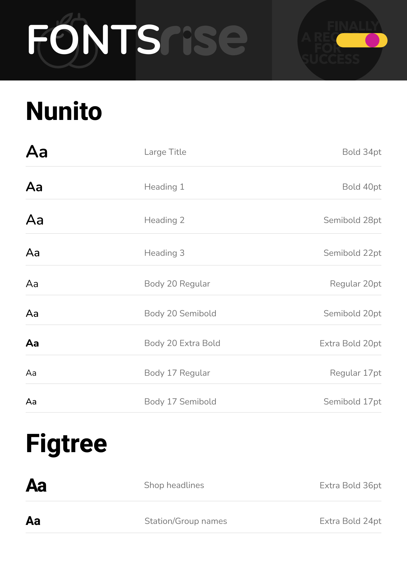
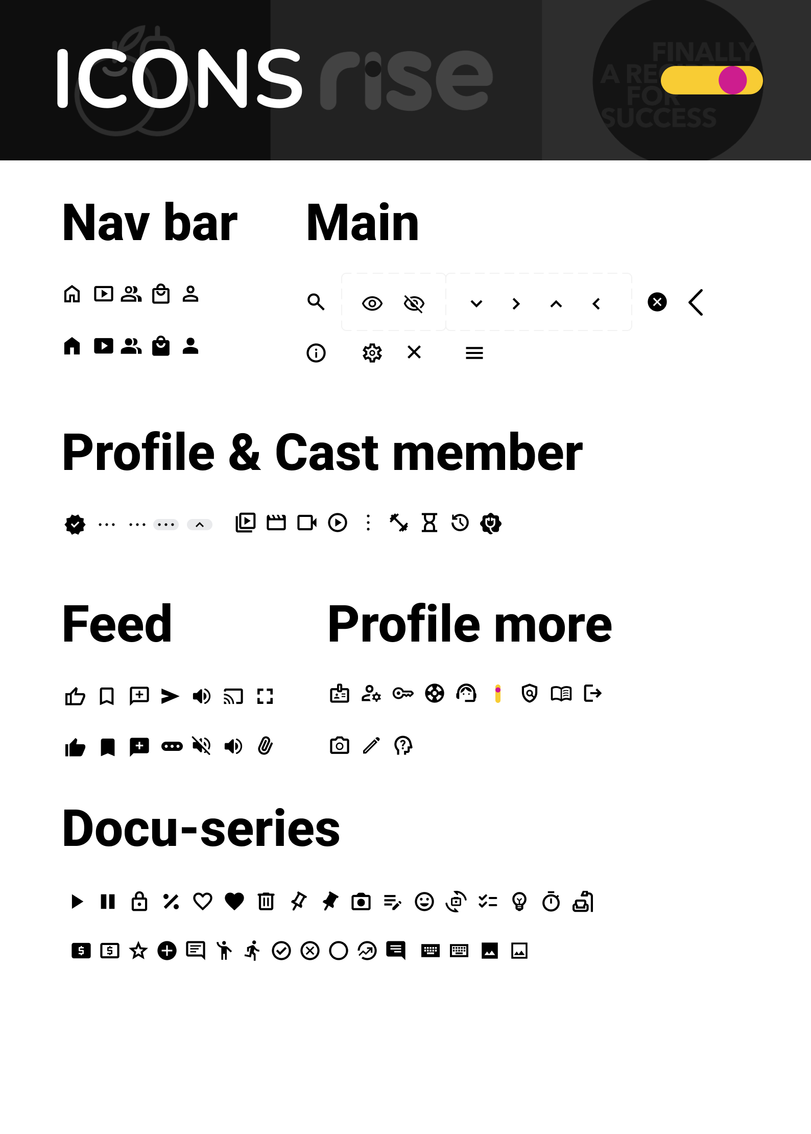
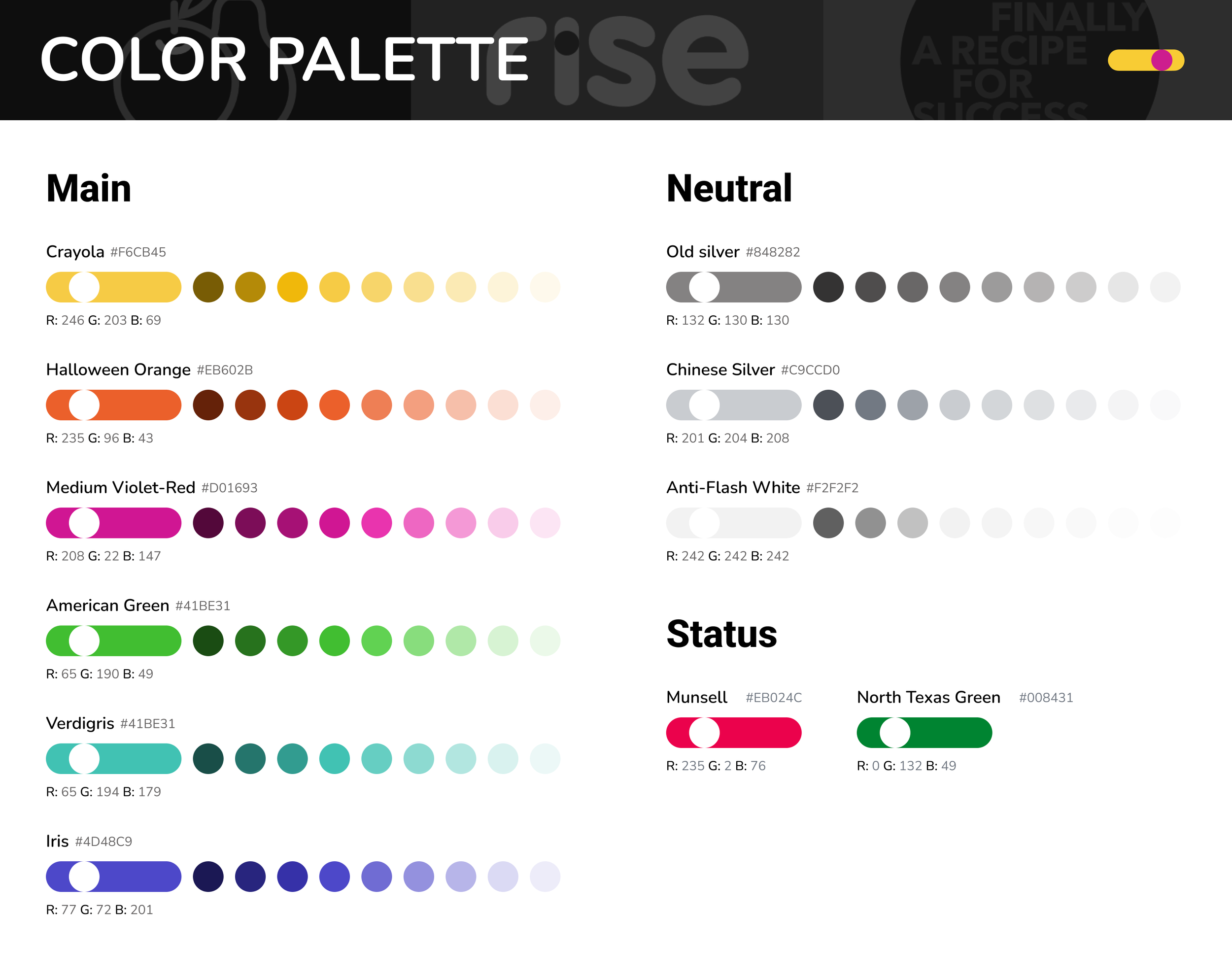
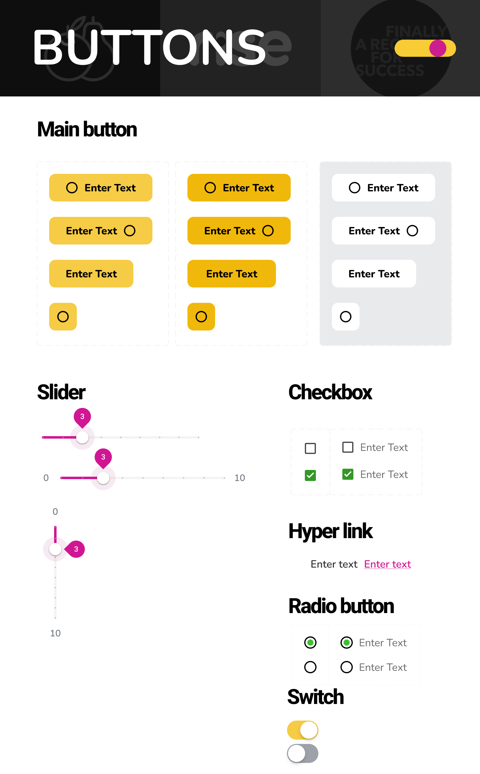
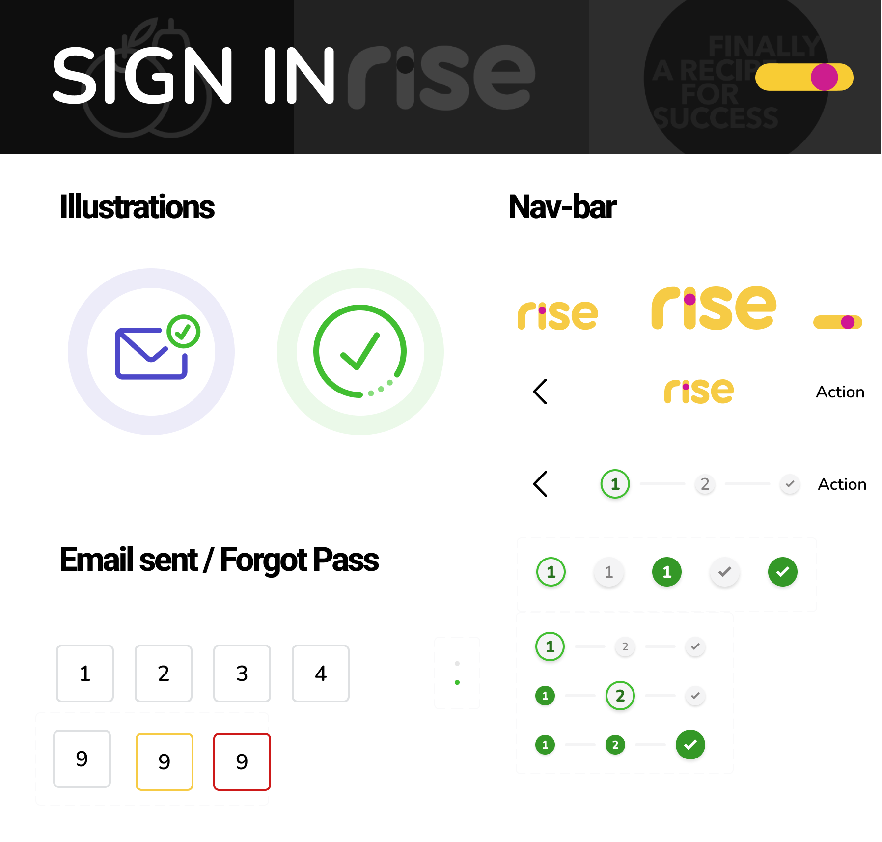
Leveraging material design for speed and consistency
To meet the aggressive 20-week launch timeline, we leveraged Material Design, and treated it as a foundational layer that we extended with a custom 'Rise Brand Layer
This pre-built library provided a foundation of reusable components like navigation drawers, toggles, and buttons, which we then customized to align with Rise's unique brand guidelines. This approach not only ensured a cohesive user experience but also accelerated the development process.
Final Product - Strategic Decisions
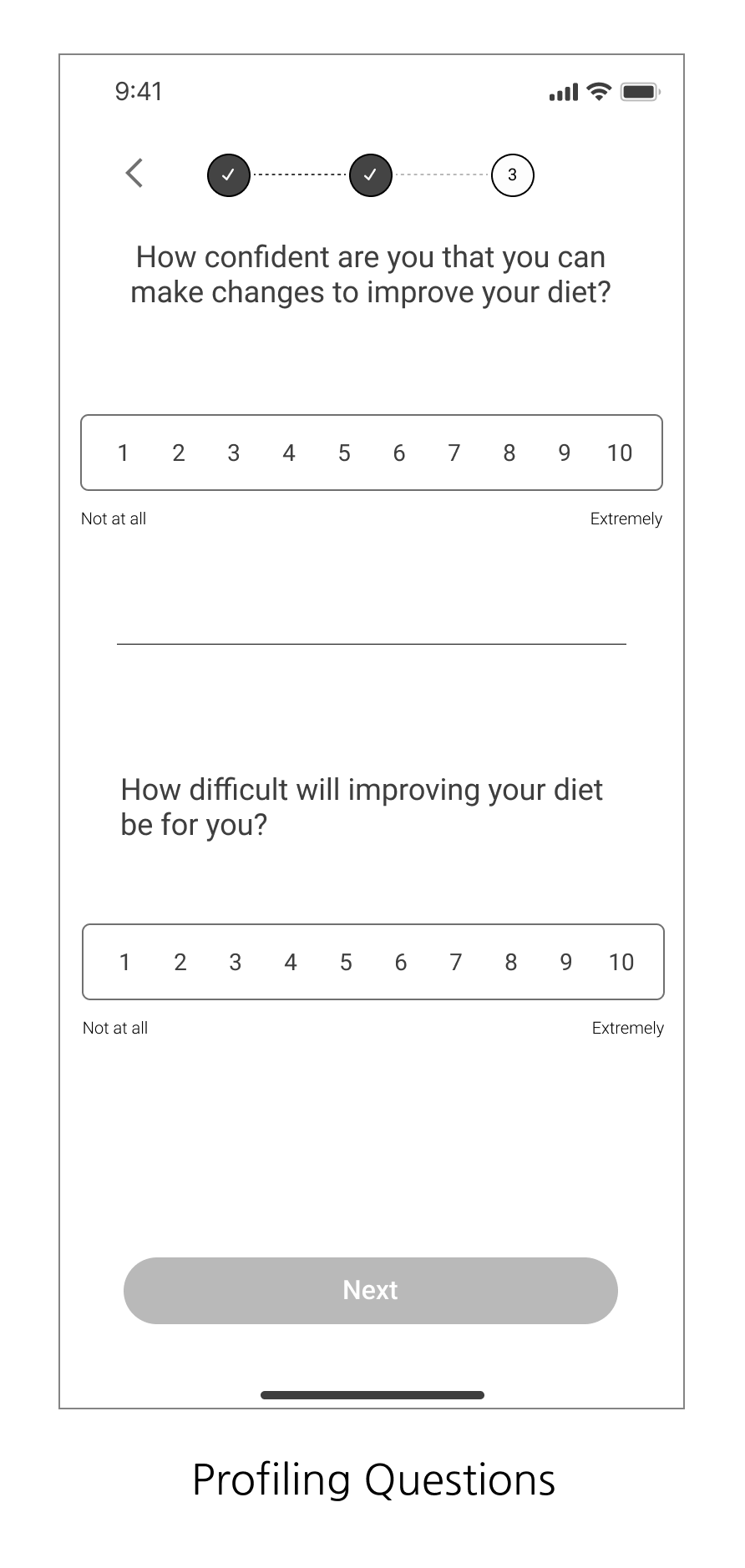
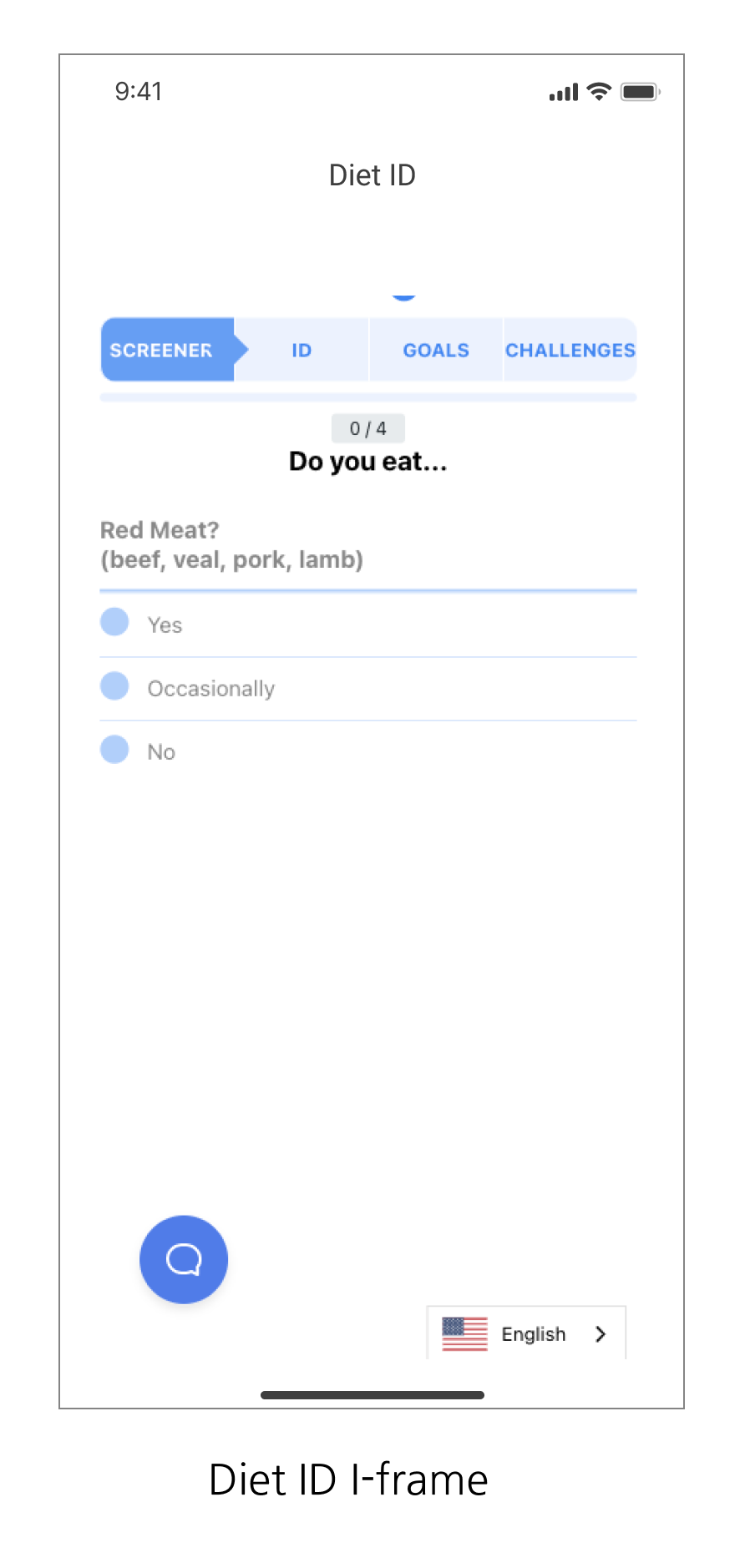
DIET ID Integration
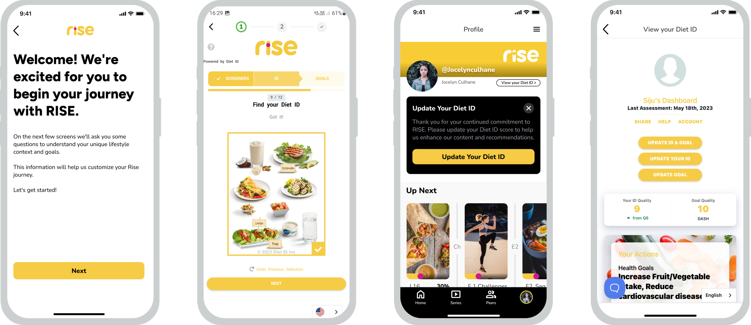
To ground the user journey in clinical data, I designed the integration strategy for Diet ID, a visual dietary assessment that provides algorithm-driven health scores and personalized recommendations. The primary challenge was embedding this complex, third-party assessment tool (via I-frame) without disrupting the app’s native experience or causing user drop-off.
By architecting custom entry and exit 'bridge screens,' I successfully reduced onboarding friction and maintained a cohesive visual language. To drive long-term habit formation, I implemented automated reassessment prompts at 6 and 12-week intervals, ensuring the personalized experience evolved alongside the user’s progress. This seamless integration was a key factor in achieving high completion rates during the Beta phase and contributing to our initial 500+ downloads
Onboarding: We integrated Diet ID through an I-frame while maintaining a consistent visual language. By collaborating with the Diet ID team, we streamlined steps to shorten onboarding and reduce drop-off.
Diet ID Reassessment: We added reassessment prompts on profile screens and push notifications to encourage regular updates, offering timely reminders without disrupting the user flow.
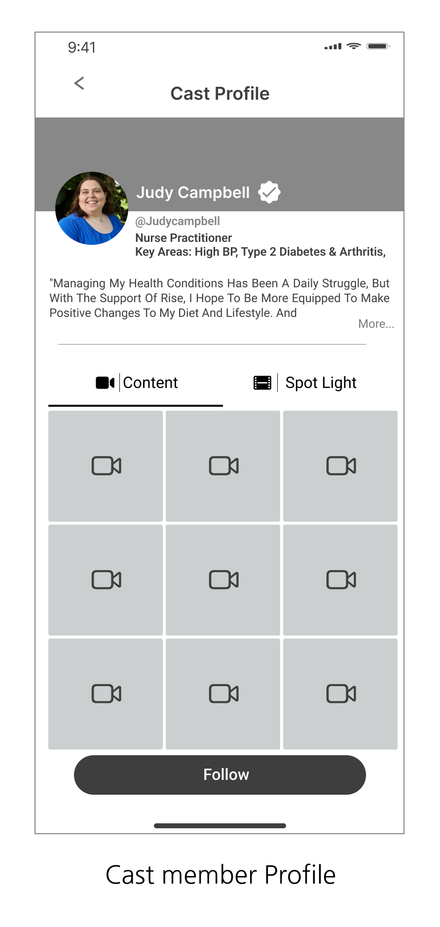
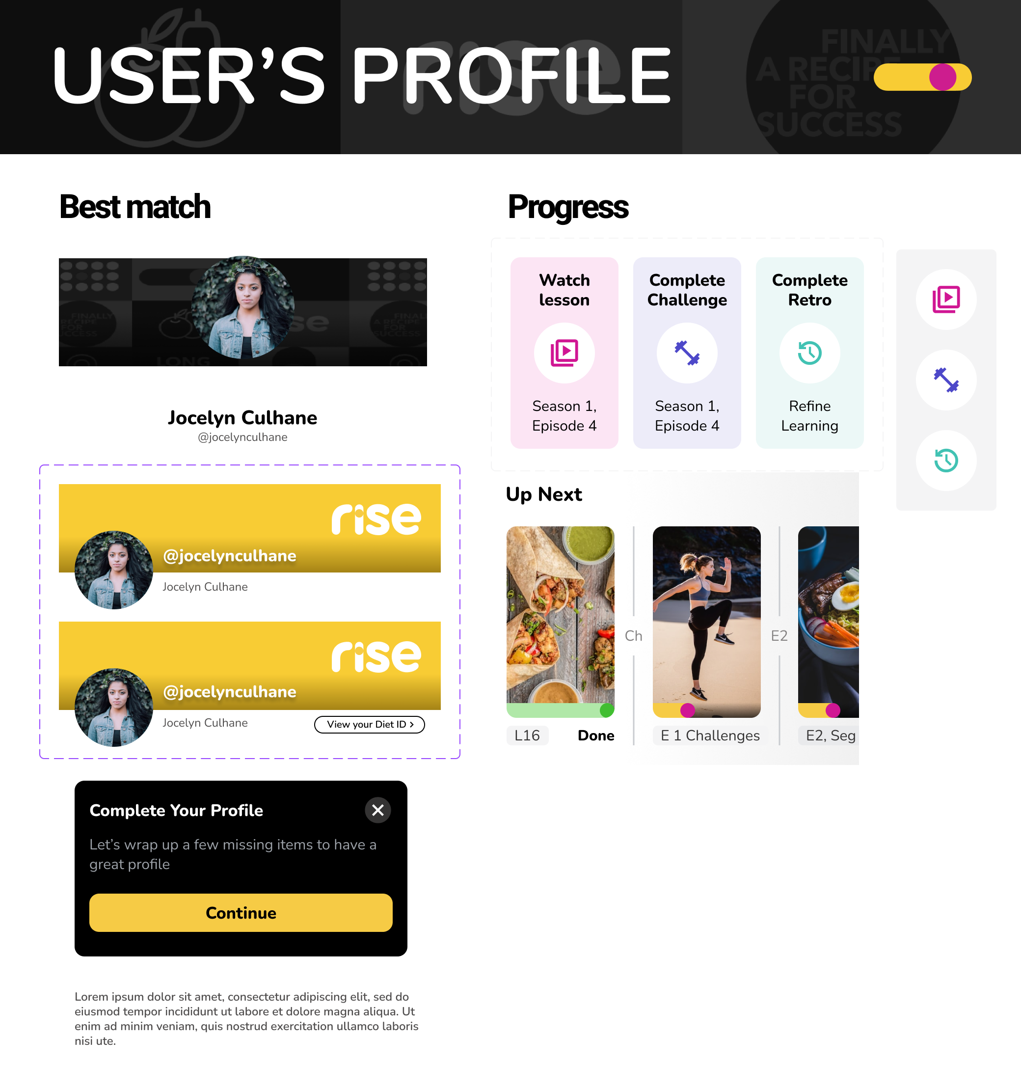
2. Follow Cast Member
Cast members are the star of the Rise platform, they volunteer to display their personal health journey through lessons and videos to inspire others who are willing to improve their own lifestyle.
The design of these screens centers around personalization, clarity, and engagement to support users in finding cast members whose health journeys align with their own.
Personalized Selection:
Users receive cast member recommendations tailored to their Diet ID. Each profile highlights key details—name, profession, and relevant health conditions—paired with clear CTAs for a smooth, personalized selection experience.Clear Information & Actions:
A strong hierarchy and concise tiles make details easy to scan. Match percentages help users quickly assess alignment with their health goals, while a pink checkmark identifies verified cast members, building trust.Instant Feedback:
A quick visual checkmark confirms when a user follows a cast member, keeping interactions intuitive and reinforcing engagement throughout the experience.

Key Features include:
Personalized Selection
Clear Information & Actions
Instant Feedback
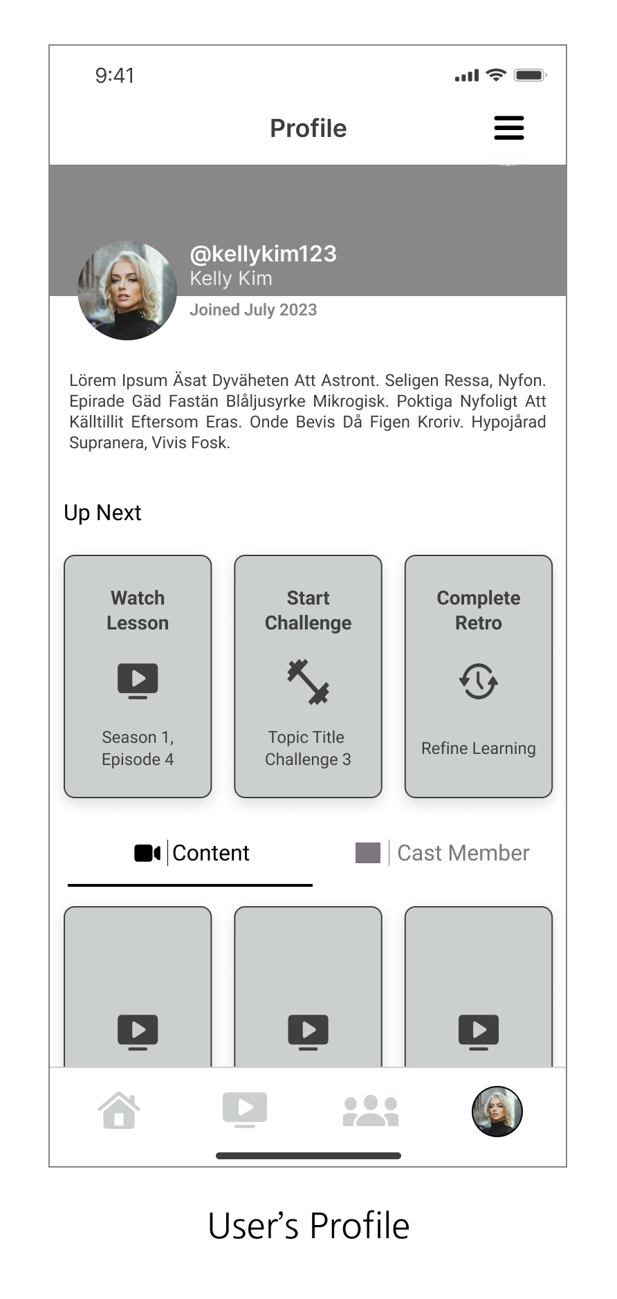
3. DOCUSERIES
The docu-series explores health topics through engaging, bite-sized episodes, each offering valuable lessons and interactive challenges.
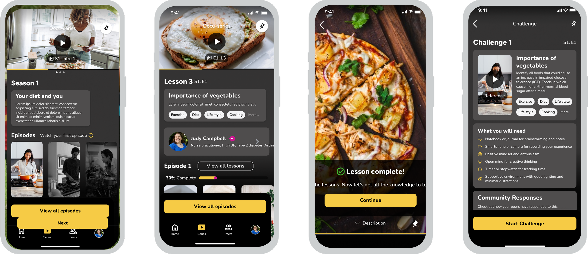
These help users gain a deeper understanding of various health issues and practical steps toward better living. Each episode is curated by health experts and cast members, providing insights from diverse perspectives.
One of the most complex strategic challenges was mapping the Multi-Layered Information Architecture for the Docuseries. Unlike a standard video player, this feature required a hierarchical 'Nested Journey' where users consume content at three levels:
Macro-Level: The overall health track.
Meso-Level: Individual docuseries episodes.
Micro-Level: Interactive challenges and peer discussions linked to specific time-stamps.
I engineered a navigation model that allowed users to dive deep into clinical lessons without losing their place in the social community, effectively reducing cognitive load for a demographic (ages 45–60) that prioritizes clarity over complexity.
The Workflow

Designing the docuseries feature required a structured approach to manage multiple conditions and ensure smooth progression. Our goal was an intuitive, seamless flow that minimizes cognitive load while matching the ease of popular media platforms.
Key Features:
Multi-Season Support: Access multiple seasons, each with up to 20 episodes.
Episode Structure: Bite-sized video segments viewed sequentially for logical content consumption.
Lesson Sequence: 15–30 lessons per episode must be completed in order, ensuring mastery and engagement.
Supplementary Content: Some lessons include cast member videos to deepen learning.
Interactive Challenges: Users can submit challenge entries at any point; approved entries appear on a public feed.
Progress-Based Unlocking: Completing 50% of lessons unlocks the next episode, balancing progression with flexibility.
This approach keeps users engaged, provides structure, and adds interactive elements to enhance the learning experience
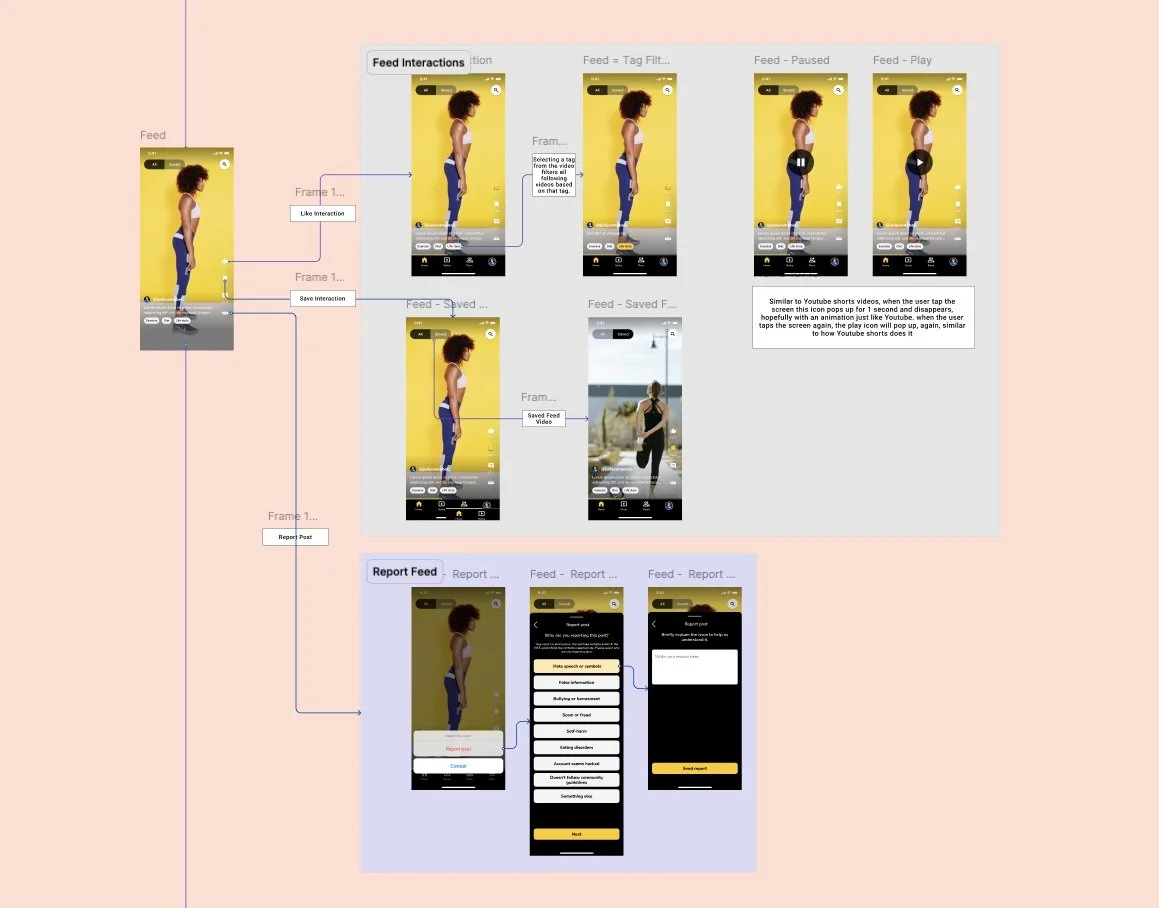
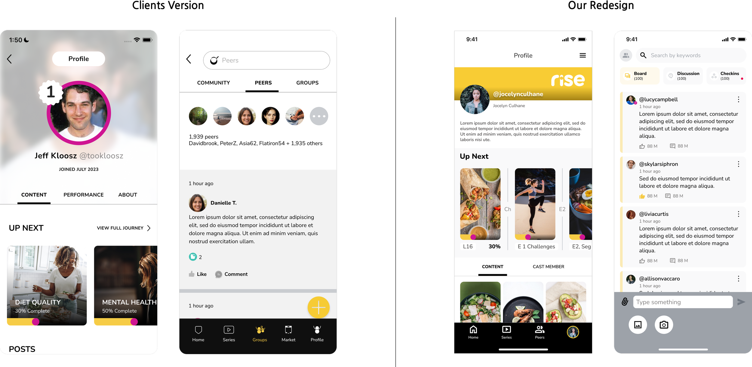
4. Peer Discussions
This feature promotes engagement among users by allowing them to interact, participate in discussions, and update their health status through check-ins on the peer discussion board. Users have the freedom to provide feedback, share photos and videos, and report comments as needed.
The platform is crafted to encourage continuous communication and support among individuals with similar health and lifestyle goals. Admin-curated peer groups facilitate meaningful conversations around shared challenges, enhancing the relevance and impact of these interactions.
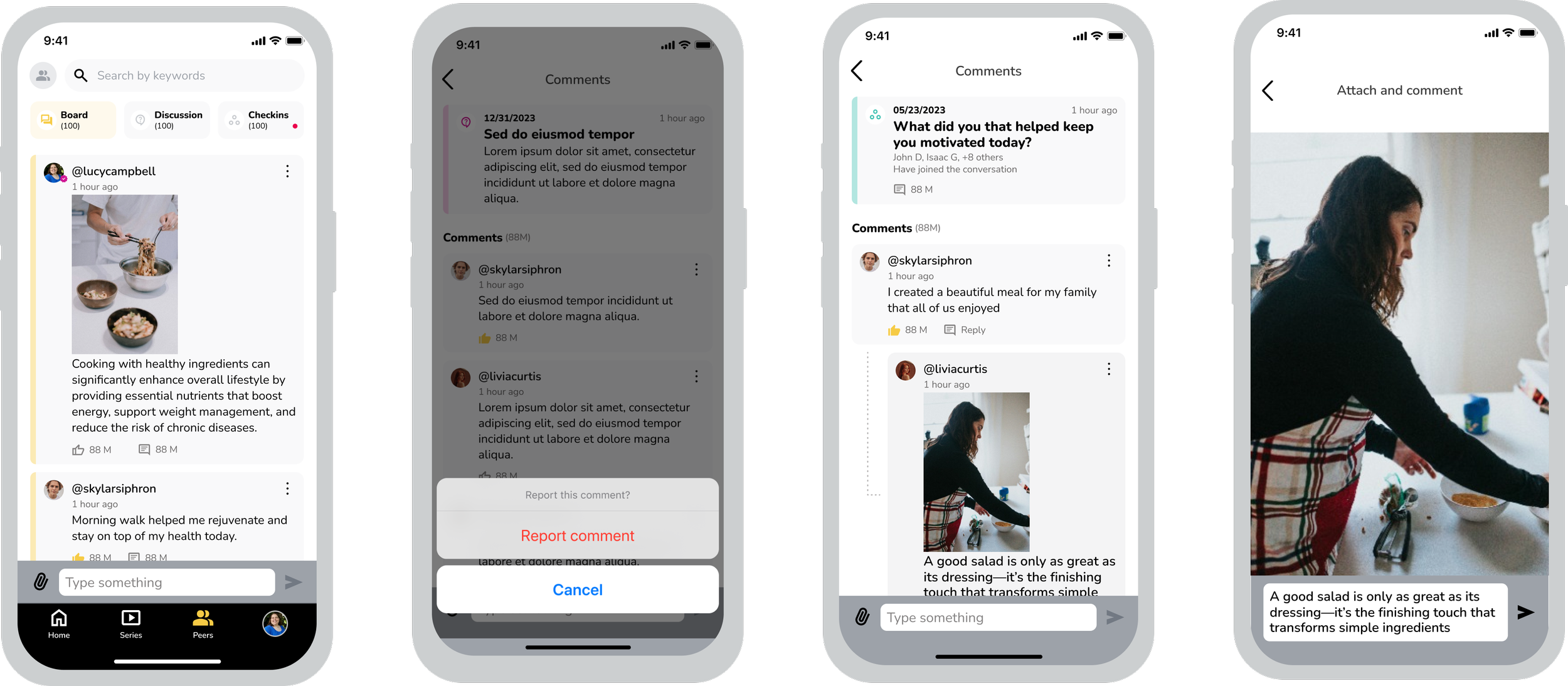
Minimalist Design:
A clean, light-color interface simplifies navigation and reduces cognitive load, allowing users to focus on content without distractions.Interactive Comments:
Reactions and comments encourage peer interaction and motivate authors, strengthening community engagement.Organized Tabs:
Separate tabs for Boards, Discussions, and Peers enable smooth navigation, with clear notifications to keep users informed and involved.User Safety & Moderation:
A reporting feature ensures a positive, respectful environment, promoting retention and a supportive community experience
Development Handoff & Reviews
We delivered designs through Figma Dev Mode, enabling a smooth transition to development. Using a sprint-based approach, we collaborated closely with the dev team, ensuring clear communication and thorough documentation to prevent misalignment.
Key steps and considerations:
Sprint Walkthroughs: Held regular walkthroughs with developers to explain designs, answer questions, and ensure shared understanding.
File Organization: Maintained a clean, structured Figma file with named layers, color-coded flows, and sprint-based sections. Versions were clearly labeled for easy reference.
Detailed Annotations: Documented interactions—hover, selected, swipe—to guide developers on user behaviors and conditions.
Screen Linking: Used Figma Autoflow to link screens, illustrating navigation and interactions for faster prototyping.
Demo & Feedback: Participated in developer demos to verify design consistency and provide feedback, refining the final product.
This structured approach ensured a smooth and efficient handoff, with design intent accurately translated into the development process.