One
As a part of my Capstone Project, I worked with StartUp Peel community, to create a project management tool for them and their community partners, maintaining a focus on collaboration & adaptive timeline, and keeping the interface clean, simple and intuitive.
Client
StartUp Peel Community & their Partners
My Role
Project Manager, Researcher, Visual designer
Platform
Desktop
Duration
8 weeks
Who is StartUp Peel?
Start Up Peel, is a Startup Canada Community in the Region of Peel, Ontario bringing together people passionate about collaboration, Innovation & learning. They help entrepreneurs at all stages of their business journey through mentorship, national & global events, sponsorship through grants and partnership support.
Clients Challenges
Our business is helping communities and new businesses succeed. We need a custom project management software that’s simple, easy, and intuitive, for our team so they can better help our clients.
RESEARCH : Investigating the problem space
Research Methodology
-

Interview
Interviewed stakeholders and a variety of people who work on teams and/or work as project managers. Some work with the client and others do not.
-

Comparative Analysis
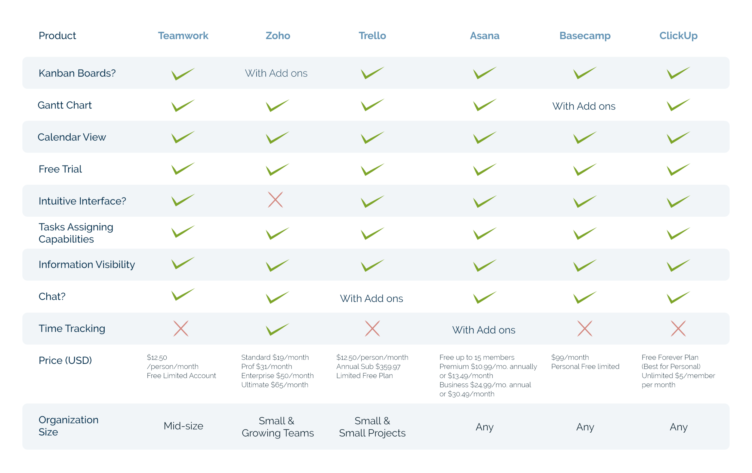
Analyzed the features of several management systems currently available on the market to understand standard practice and how they are implemented.
-

Competitive Analysis
This analysis painted a picture of how the currently available management systems position themselves in a busy market.
Interview Insights
We interviewed stakeholders, community partners, community collaborators all linked to StartUp Peel and professional project managers.
The diverse group helped us understand the pain points and their experience with existing management platforms.
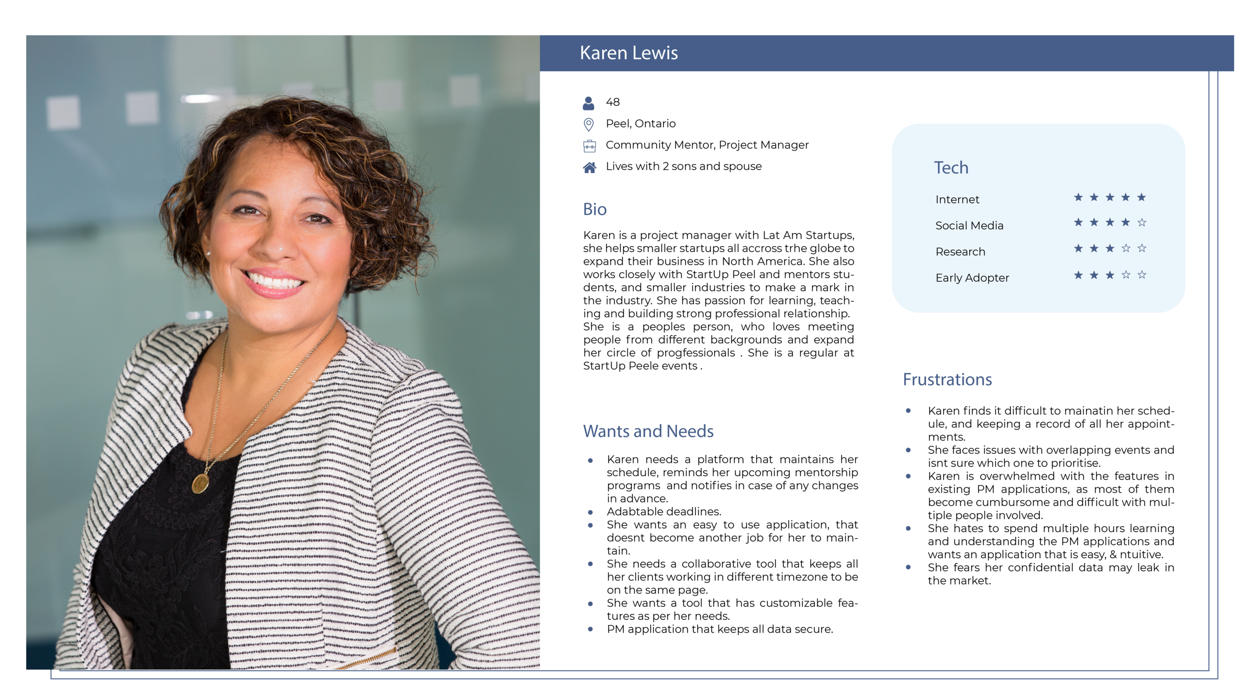
User Persona
Comparative Study
Research Insights
The interface should be simple, intuitive and easy to learn
Application should trigger reminders and notifications
Application should allow customization for the required features for the user.
Must facilitate communication and collaboration.
Platform should be secure.
Value Preposition and Business Canvas
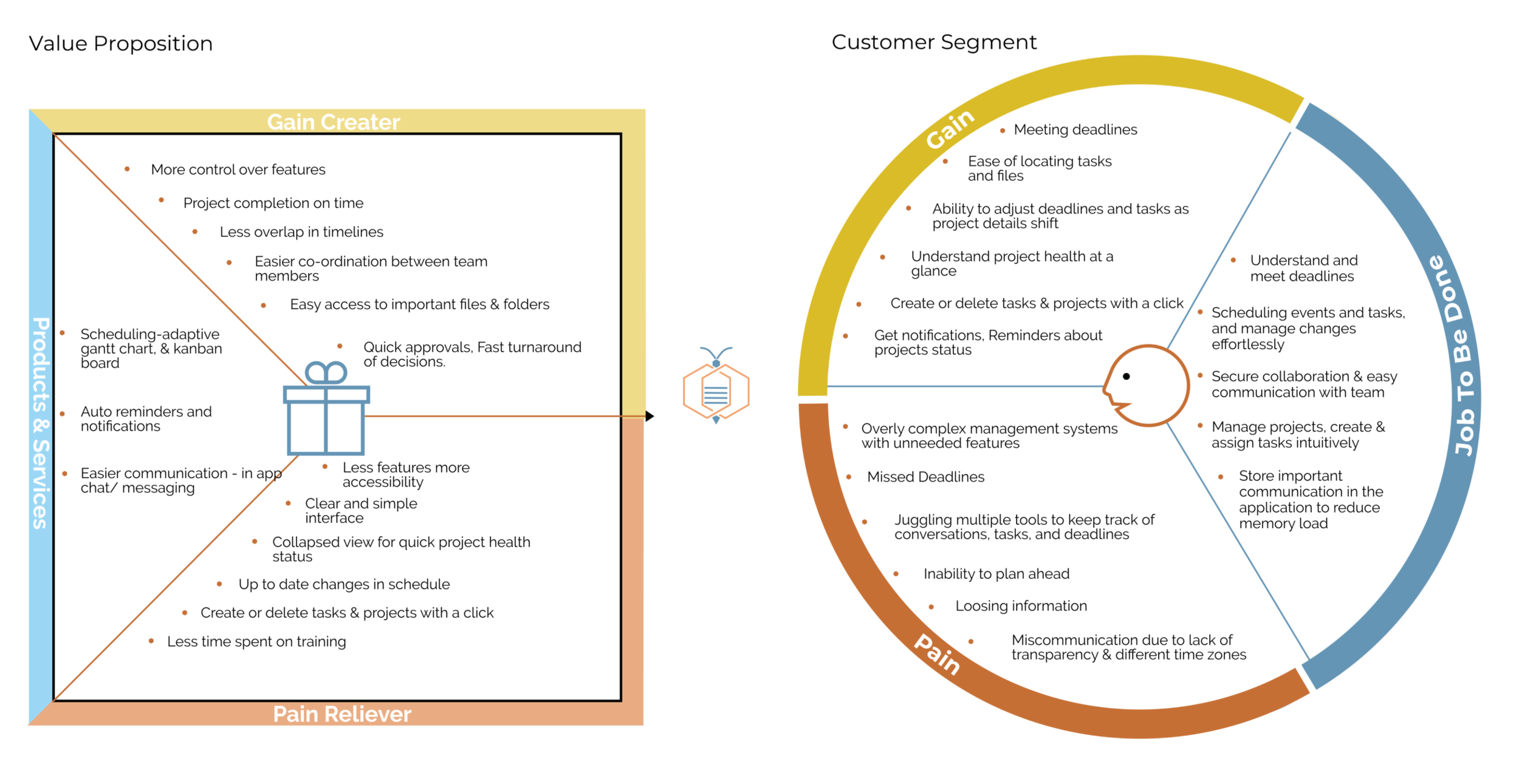
Creating value preposition and business canvas helped us understand the specific goals of the client as well as the pain points experienced by their team. This ensured that we could link our solutions directly to the related frustrations to improve the user experience.
Value Preposition Canvas
Takeaways:
Key users for the app is StartUp Peel community & its partners.
Simple, intuitive interface, for users of different backgrounds.
Easy collaborations, and adaptable deadlines.
Reminders & notifications for all stages.
Brainstorming & Initial Design
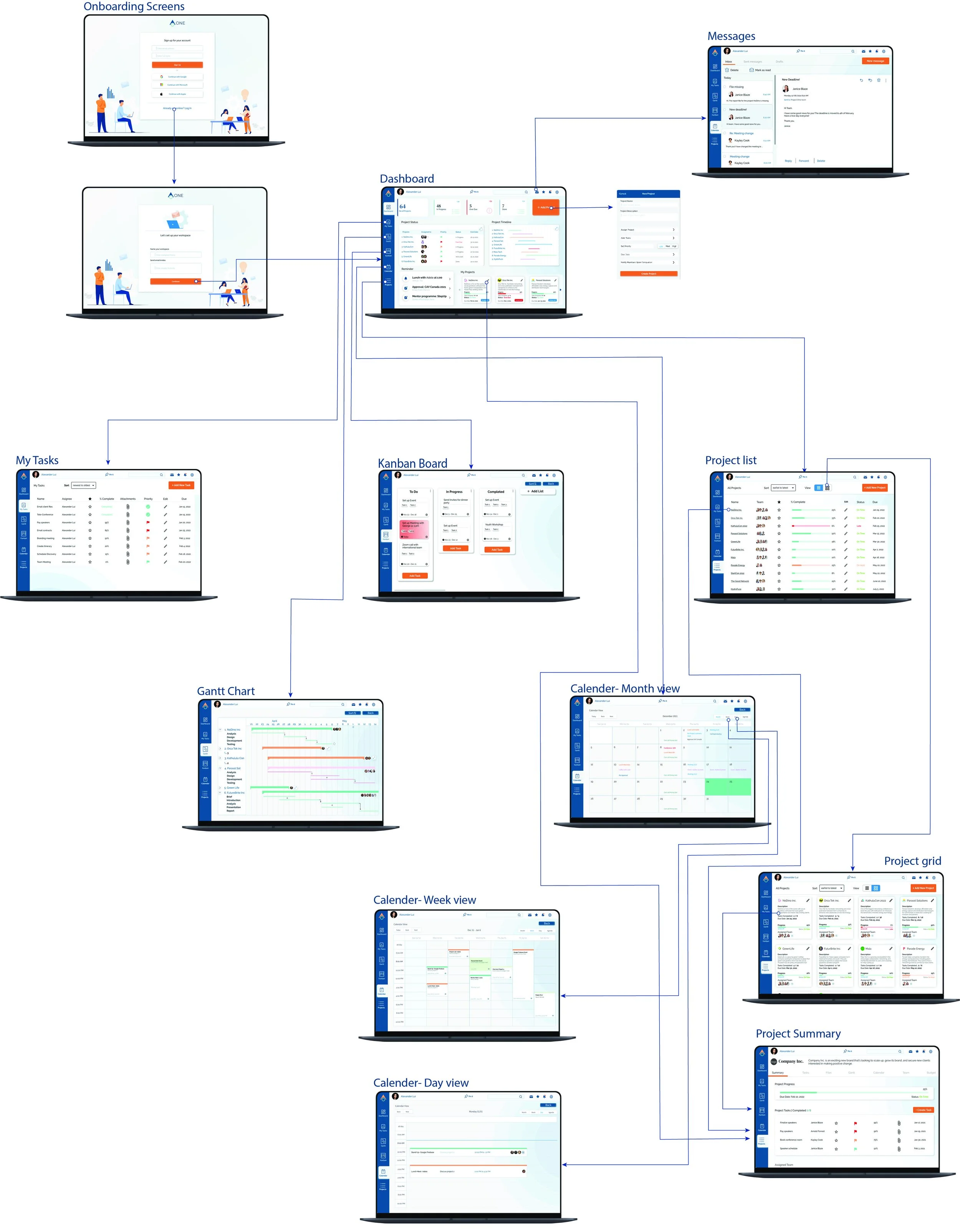
User Flow
Lo-Fidelity Sketches
-

Dashboard
-

Gantt Chart
-
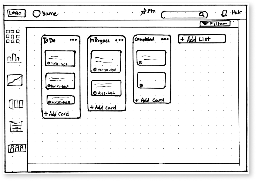
Kanban Board
-

Project Page
Application Name & Logo Design
Application Name
We presented the client with 3 different options for the name for the application & Logo variations. The client chose the first option ‘ ONE’ for the name & logo option. The name is easy to remember, unique and reflects the functionality of our Project Management application, that is ‘One app for all your needs’.
Logo Design on white and navy background
Make it stand out
Whatever it is, the way you tell your story online can make all the difference.
STYLE GUIDE
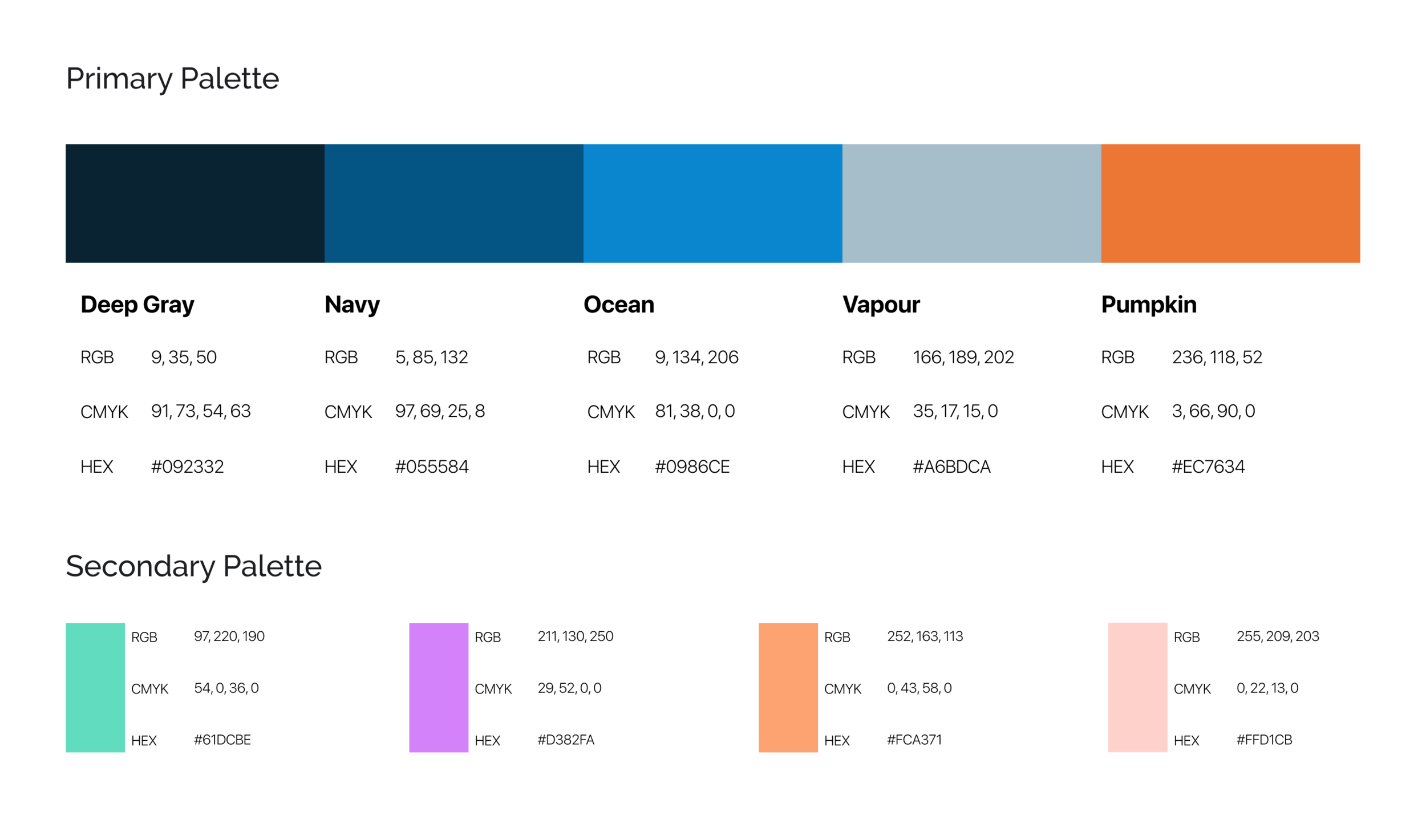
COLOR PALETTE
TYPOGRAPHY
ICONS
Mid-Fidelity Sketches
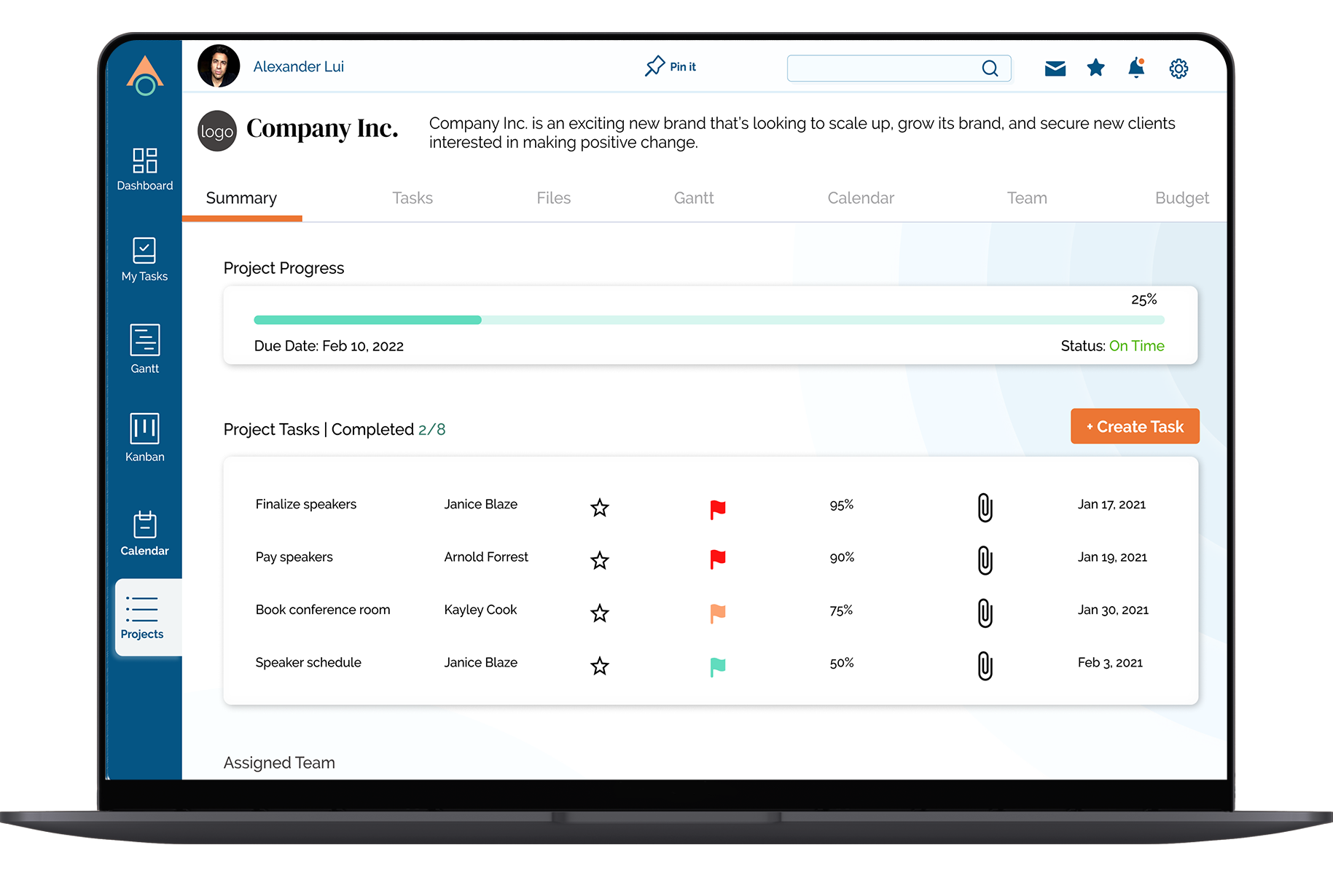
Hi- Fidelity Mockups
USABILITY TESTING
Remote Testing- MAZE
We constructed a series of tests for our users to determine the clarity and ease of use of the application. We wanted to know how easy it was to locate certain information and CTA buttons as well as ease of carrying out certain tasks. The tests were performed remotely using MAZE, and was undertaken by 25 participants.
Task 1 :
Can you create an account for your company?
Results :
All participants performed this task quickly.
Recommendations :
Labels were clear and intuitively placed- No changes necsessary
Task 2 : Navigate through the calender, go to week view and view details of project due on 3rd January
Results: 12/25 users performed this task without any trouble while 13/25 took longer to locate the exact date
Recommendations : Make the dates & time in the calendar more legible by increasing type size.
Task 3: Please confirm if you have received any messages, and see if you have any messages waiting to be sent.
Results: Users had a lot of difficulty locating the message icon. After searching the screen they tried clicking on the notification bell which was inaccurate.
Recommendations : Change the icon to a more universally understood message icon along with its placement with the rest of the icons.
Heat Map
Task 4 : Find your way to the projects page and open up the NoDino Inc. page and add a task.
Results: Most users (19/25) performed this task quickly without facing any issues finding the tile, while some users (6/25) had indirect success having multiple mis-clicks.
Recommendations : No changes, as users tried clicking on the project page icons on Gantt chart & Kanban, which would direct them to the project page in an actual application.
Task 5: Can you switch your Project view from list view to grid view and Edit a task.
Results: Users found this task a bit confusing, 3/24 testers gave up the task & test at this stage, while 6/24 found there way to the edit button after multiple miss clicks. Users mentioned about the inconsistency of the edit icon in the list & grid view, some users also mentioned that they didnt realise which view they were on.
Recommendations : Keep the edit icon consistent, Highlight the view icon, and give option to edit in the enlarged project page
Project Grid Heat Map
Quotes by Testers for the overall usability.
“The icons are clear enough, similar to other ones”
“Usability is good, but somehow it doesn’t feel harmonized based on the overall navigation and functions of the platform”
“The application overall is very neat and clear. I think the users will find it easy to navigate across the pages. The overall layout along with the text format and text color that are chosen on the website is good”
“I found use of “project” confusing where I would have used “task” as a To Do item within a project. In general though, quite usable”
Changes based on user feedback
1) Changed the message icon & position it next to the notification icon, to keep all CTA icons at one place.
2) Increased font size for calender’s date & time, for it to be more legible.
3) Changed Add Project to Add Task in Kanban
4) Made the ‘edit’ icon consistent throughout the project to a more discover-able pencil icon
5) Ensured consistency between typefaces and type size, visual elements, and buttons.
What I’ve learned
Communication is key.
Research is vital for development of any product.
Creating a product doesn’t always mean re-inventing the wheel. Innovation is in creating the right product for right user.
The value proposition chart is very useful in itemizing user’s pain points and to ensure the prototype is designed to address these specific issues.
User testing was imperative. It’s easy to miss details when you’ve looked at the same screen for a long time and you need to challenge your assumptions and biases.


