
Veteran Credit Card Application
Responsive Web & Mobile App . Design System . Dev Handoff
“Facilitated back end database migration for Web and Mobile apps to Flutter flow, unifying the digital assets for the platforms, ensuring minimal visual changes, smooth user adaptation, and a seamless cross-platform experience.”
“Facilitated back end database migration for Web and Mobile apps to Flutter flow, unifying the digital assets for the platforms
Team

Client
My Role
Responsibilities
Platform
UI Designer, Solution architect, 2 Front End Dev, Project Manager
AAFES, USA
Product Designer
UX strategy, research, interaction design, accessibility,handoff
Flutter Mobile & Web App
The Problem
"1.6 million cardholders were ready for a revolution, not just a redesign."
Serving a massive, dedicated user base, The Military Star platforms suffered from visible inconsistency between the web and mobile interfaces. Stakeholders initially requested a low-risk ‘lift-and-shift’ migration to Flutterflow, which would only transfer and cement the existing, frustrating usability issues.
Challenge : Rebuilding without a blueprint
We didn't just face technical hurdles—we battled approval delays and fundamental design flaws.
Inconsistent Ecosystem
The Mobile and Web platforms were non-identical twins. Their feature sets were fundamentally different, making a unified "lift-and-shift" impossible.
Zero Access, Zero Files
Strict compliance, and no original design files, we rebuilt the user flows from screenshots for both Mobile and Web app
The Scalability Trap
Copying existing features directly risked crippling performance on the new architecture, potentially making the platform slow and unstable.
Design System Showdown
Switching to Flutterflow demanded a full redesign to align with Material Design. This major visual shift was a challenging sell to risk-averse stakeholders.
Regulatory Gridlock
Every detail required multi-layered legal and compliance review, creating crippling approval delays that severely hampered the project timeline.
Solution : Immediate stability and a strategic roadmap for a cohesive future.
We provided screen-specific resolutions for UX updates following the design audit, categorizing them into 'Must-Have’s' and 'Nice-to-Have’s'.
Proposed incremental improvements to various features that will directly enhance the user experience without altering the overall visual aesthetic.
Design Process : Strategy, Audit, and Unification
Our approach was to systematically dismantle the client’s "lift-and-shift" mandate, using data-backed audits and competitive intelligence to build a case for strategic redesign.
1) Design Benchmarking :
We began with a competitive analysis of major credit card platforms to showcase the necessary distinction between web and mobile features. This provided the insights needed to advocate for a unified, modern experience rather than a simple migration.
2) Design Audit
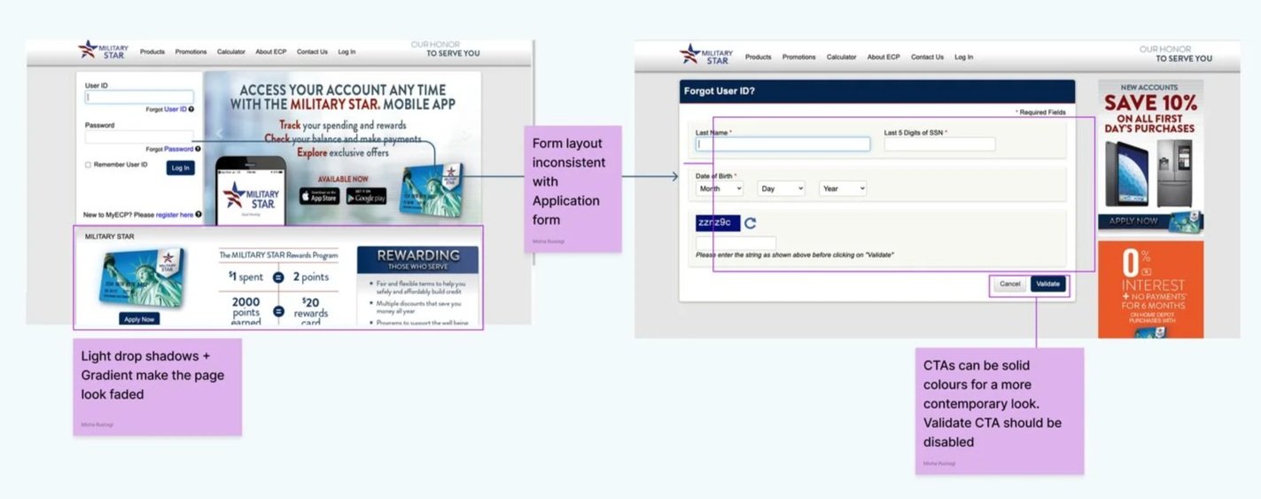
We conducted a comprehensive design audit and benchmarking to identify gaps and inconsistencies between the mobile app and responsive web app. Due to restricted access and confidentiality, obtaining screens with actual data was challenging, leading to multiple back-and-forths.
UX Findings
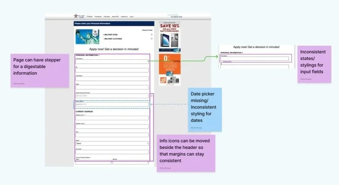
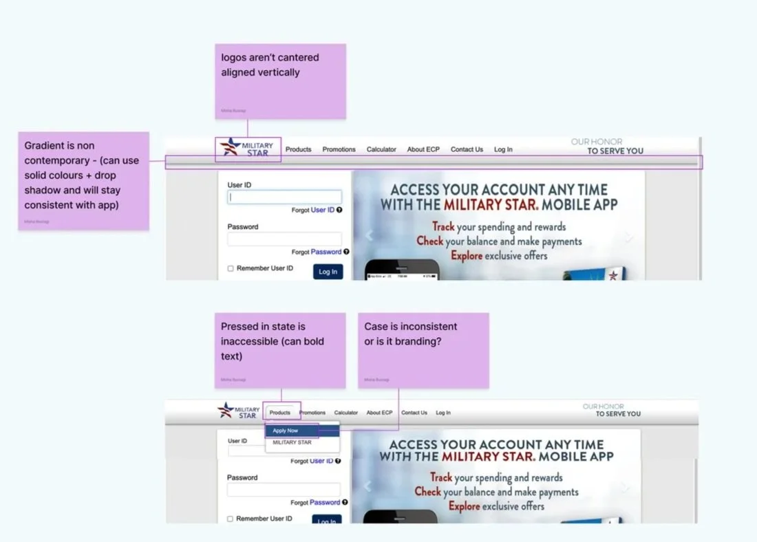
Inconsistent Design elements across Web app and Mobile app
Lack of Show Password Feature
Distracting persistent notification tabs
Missing Success and Active States
Lack of adherence of law of proximity principle
UI Findings
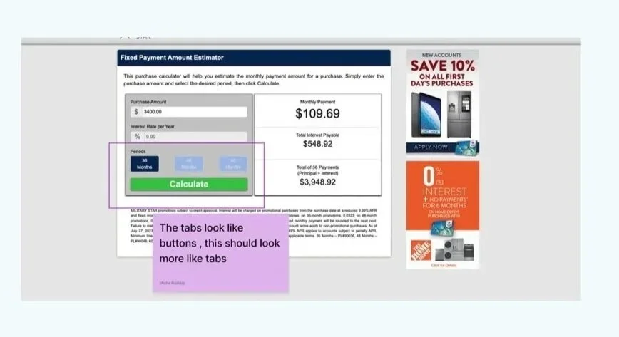
Inconsistent styling of UI Elements like CTA, Toggle buttons, input field etc
Variable CTA Placement
Tight Information Layout impacting readability
Inconsistent Font and Visual Hierarchy
Inconsistent Success and Error Colors
-
Forgot User Name
-
Payment Calculator
-
Card Application Form
-
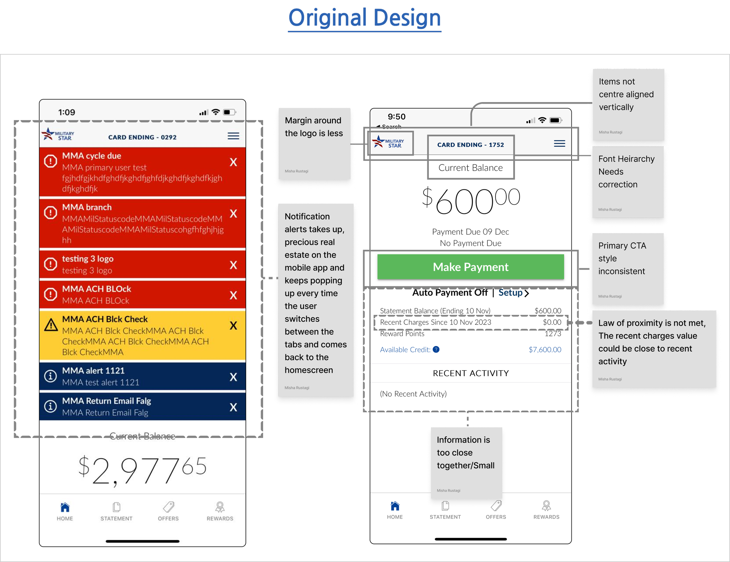
Homescreen
3) Strategic Redesign & Defense
We executed a strategic redesign, using our audit findings as the blueprint to close critical UX gaps and achieve visual consistency. To efficiently manage tight deadlines and regulatory constraints, we established a sharp 'Must-Have' prioritization list, successfully defending every data-backed decision to secure approval for faster, high-impact delivery.

Design System
To achieve design consistency across the Mobile App & website within a tight timeframe, our team leveraged the Material Design system. This pre-built library provided a foundation of reusable components like navigation drawers, toggles, and buttons, which we then customized to align with Military star’s guidelines. This approach not only ensured a cohesive user experience but also accelerated the development process.

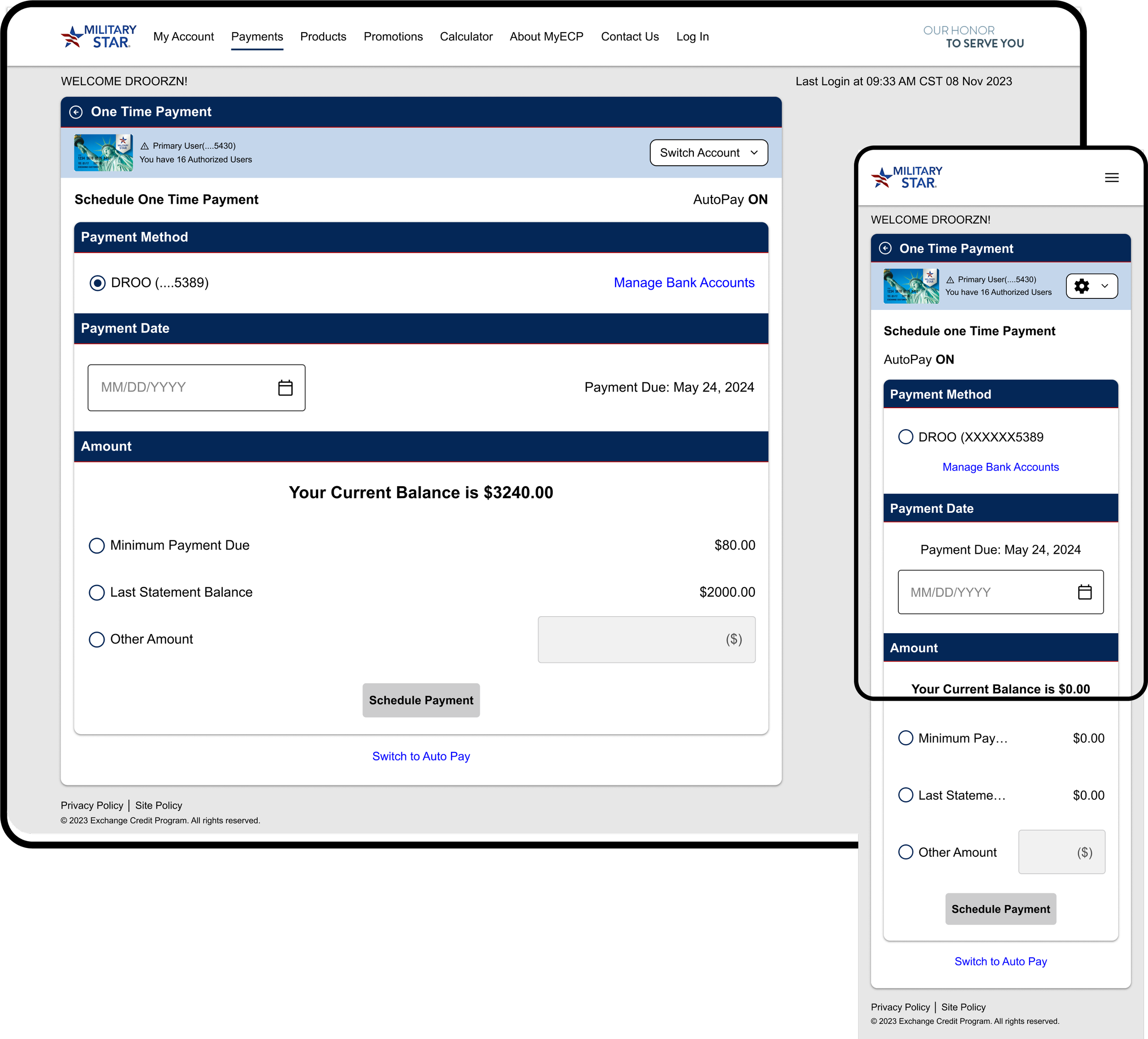
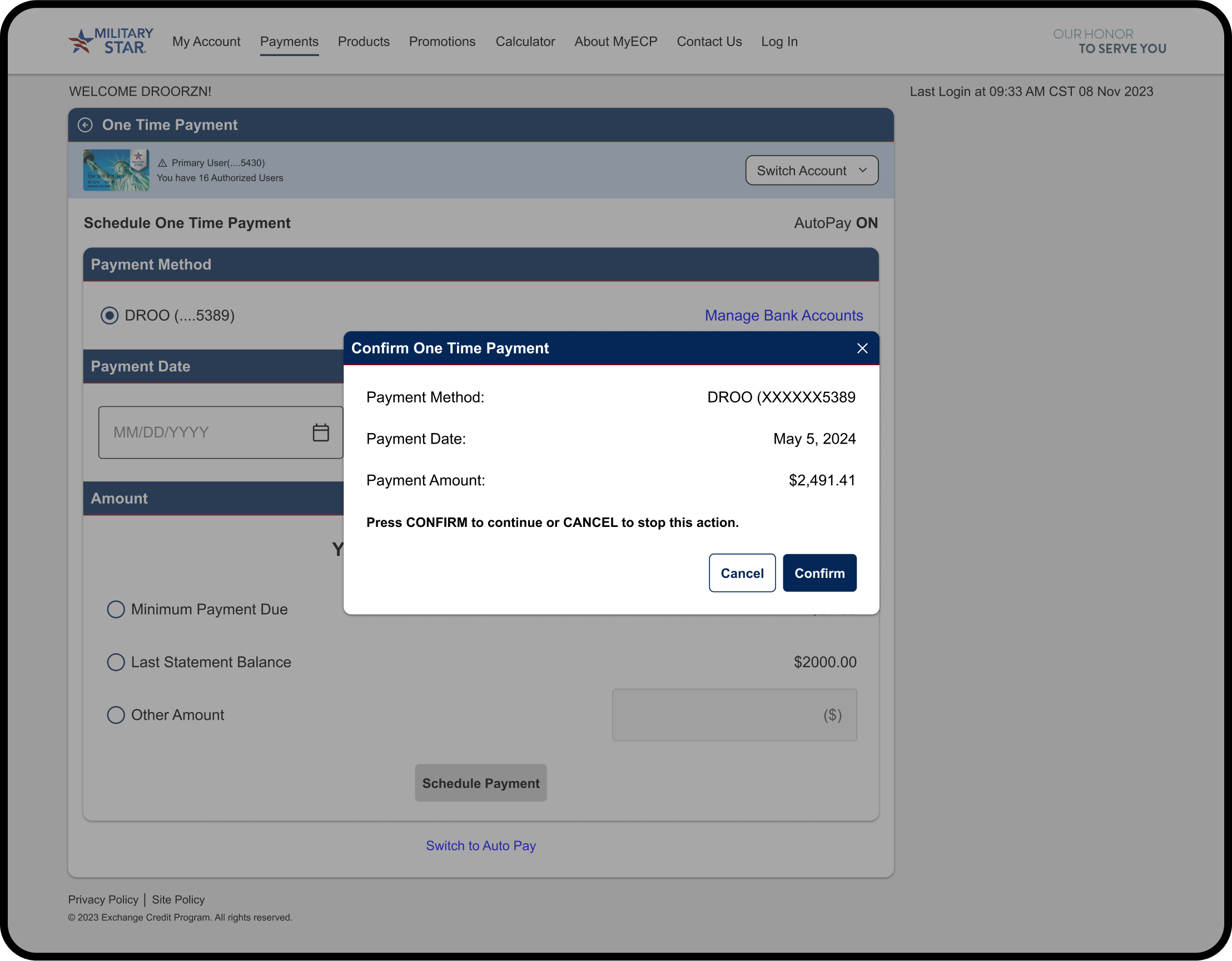
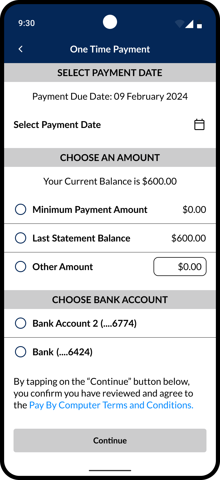
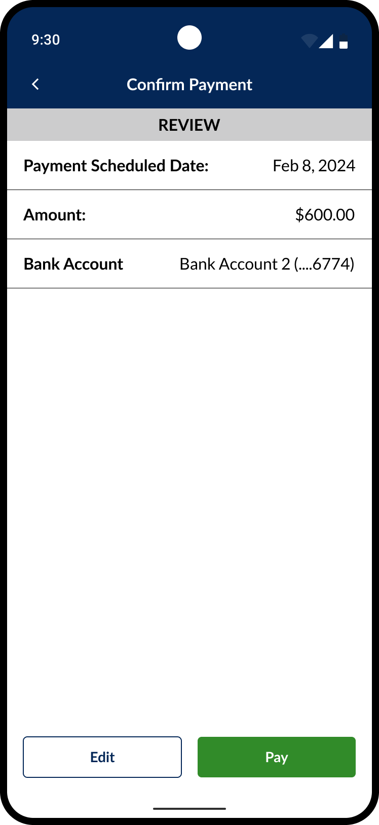
Schedule One Time Payment
The feature allows users to schedule one-time payments on both platforms. Users can select from two bank accounts, choose a payment date, and set the amount. We redesigned the screen by improving the original layout from screenshots, enhancing button hierarchy, accessibility, and content organization.
For Website, We designed responsive screens - For web, Tablet and mobile resolution.
One time payment
Success Screen

Confirmation Popup
Mobile App- One time payment screens


Development Handoff & Reviews
The development handoff was done via Figma Dev Mode, ensuring a smooth and efficient transition of the design to the developers.
The process followed a sprint-based approach where we worked closely with the development team, ensuring clear communication and proper documentation to avoid any misalignment. Key steps and consideration include:

Collaborative Walkthroughs: For each sprint, we held walkthroughs with developers to explain the design and address any questions, ensuring clear communication and a shared understanding.
File Hygiene & Organization:
We maintained a clean, well-structured Figma file with properly named layers and components.
The file was divided into sprint-based sections, with flows and components color-coded to simplify navigation and promote focus.
Each version was saved and labeled for clarity, ensuring developers had the latest design
Detailed Annotations:
Specific interactions (hover, selected, swipe) were annotated to provide developers with clear guidance on various user behaviors and conditions.
Screen Linking with Figma Autoflow:
Screens were linked to show navigation and interactions, helping developers understand the app’s flow and facilitating quick prototyping.
Demo Sessions & Feedback:
We attended developer-led demos to ensure design consistency, providing feedback on any visual or experiential discrepancies to refine the final product.
Our Impact
The project initially began with a straightforward "lift and shift" approach, migrating the original mobile and web platforms to Flutter Flow. However, despite its apparent simplicity, the client overlooked several critical nuances that we highlighted throughout the process.
Our intervention and constant explanation of the decisions we made during the redesign created the following impact :
Enhanced User Experience: We addressed the gaps identified during the audit and created a more intuitive experience across both platforms. This streamlined navigation for users and contributed to a notable decrease in drop-off rates.
Unified Features and Functionality: The original platforms exhibited significant differences in visual components, verbiage (UX copy), and overall experience. We successfully identified and resolved these inconsistencies, resulting in a more cohesive user experience across both platforms.
Consistent Visual Elements and Branding: We observed discrepancies in iconography and branding across the platforms. By leveraging Material Design principles and securing necessary approvals, we established a consistent design language for both Platforms
Prioritization of Features: Given the tight timeline for the Phase 1 release, we collaborated to create a "must-have" and "nice-to-have" feature list for future expansion. This helped establish a clear roadmap for the platform's ongoing development.
Project Reflection & Key Takeaways
Clear Communication is Key: Throughout the process, we maintained clear and concise communication, presenting our suggested changes effectively. This helped the client understand the importance of each decision, backed by data and facts, ensuring alignment at every stage.
Leveraging a Standard Visual Library: Utilizing a standardized visual library allowed us to design faster and more consistently, which in turn facilitated a smoother development process.
Understanding Business Logic: Working with this project, helped us recognize the slower approval process typical of a credit card company. Due to strict regulations, compliance, and security concerns, even minor changes require thorough review. This ensures legal and financial accuracy, explaining why some updates were deferred to the backlog for future implementation.
Collaboration with Development: This project underscored the importance of close collaboration with the development team. Designing for both the user interface and its implementation in Flutter Flow allowed us to quickly identify and resolve any issues that arose during front-end and back-end development.