
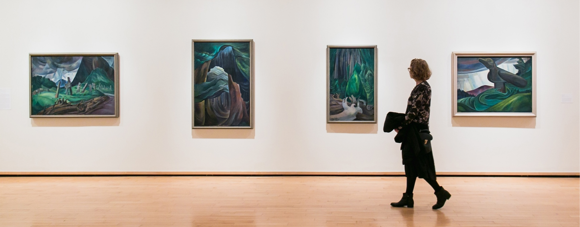
Mobile App . Quantitative & Qualitative Research . Design Audit . Redesign

Fostering belonging through Data driven Insight
A non-profit initiative by the Institute for Canadian Citizenship, designed to help newcomers explore Canada through free and discounted access to cultural, historical, and recreational experiences.
Institute of Canadian Citizenship
Client
Team
Design Lead, UI Designer
IOS & Android Mobile App
Platform
Product Designer (UX/UI)
My Role
The Problem : Downloads but No Engagement
But first, What is Canoo?
Canoo, is a non-profit initiative by the Institute for Canadian Citizenship, designed to help Immigrants ( Permanent Residents and New Citizens) explore and experience life across Canada. Through the app, users gain free or discounted access to cultural, historical, and recreational attractions nationwide.
Beyond access to experiences, Canoo acts as a bridge into Canadian society. It introduces users to diverse communities, helps them discover local events and hidden gems, and surfaces benefits across services such as telecommunications and everyday essentials. By combining discovery, access, and support, Canoo plays a meaningful role in helping newcomers feel more connected, informed, and confident as they navigate life in Canada.
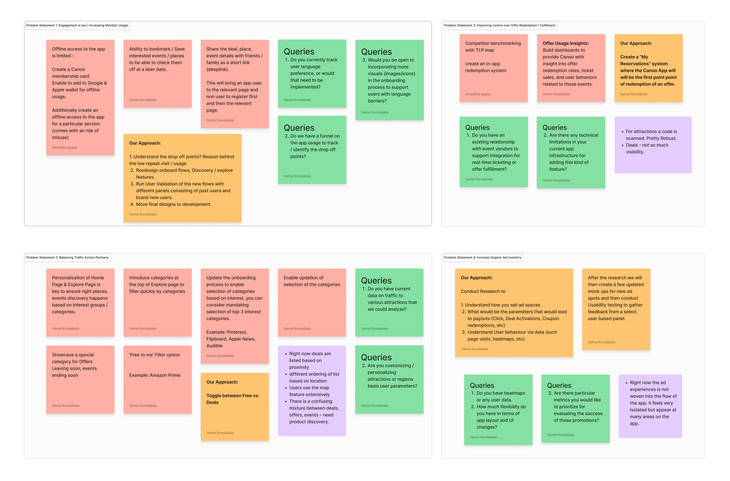
The Canoo team approached us with four core challenges that needed to be addressed. These challenges were to be resolved through deep research, analysis, and a focused design phase aimed at delivering practical solutions.
3
Balance traffic across partners
Traffic was concentrated on a few popular attractions, leaving many partner experiences underutilized.
4
Increase promotional space
Limited promotional real estate reduced Canoo’s ability to highlight time-sensitive or high-value offers.
2
Improve control over offer redemption and fulfilment
Offer redemption happened outside the app, limiting visibility into user behavior and fulfillment data.
1
Increased member usage
Many users struggled to understand how Canoo worked once inside the app, resulting in drop offs, less usage.
Rather than jumping straight into design changes, we paused to ask a more important question:
Are we solving the right problems, or just the most visible ones?
This became the foundation for a research-first approach !
Reframing the Challenge Through Research
“ If Canoo wants to become part of user’s everyday planning, not just a last-minute redemption tool,
We need to understand how, when, and why people actually use it.”
Instead of treating Canoo as a “feature optimization” problem, we reframed it as a behavioral and decision-making problem, we structured research plan combining in-app quantitative data with deep qualitative interviews, allowing us to validate assumptions at scale before redesigning anything.
Our Approach:
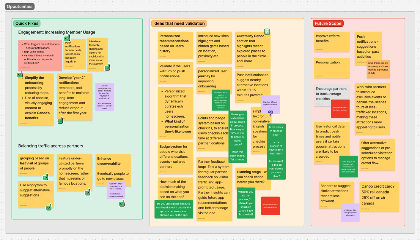
We conducted white-boarding sessions with the client to deep dive into each core problem, one by one, and analyzed:
Pain-points
Quick fixes to the problem
Ideas that needed to be validated through Quantitative and qualitative research
Future scope
2
Onboarding and Check-In Clarity
How clearly the app communicates its purpose, features, and check-in flows — especially for first-time users?
1
Personalization Interest
Would tailored recommendations, notifications, and onboarding meaningfully improve the Canoo experience?
4
Social Sharing and Community
How often do users recommend Canoo and whether community-driven discovery could strengthen engagement?
3
Usage pattern & decision making
Is Canoo used for inspiration, planning, or simply redeeming offers users already know about?
Research Goals that Guided Every Decision!
We defined five research goals that shaped both the survey design and subsequent interviews:
1
Personalization Interest
3.
Social Sharing and Community
2
Onboarding and Check-In Clarity
4.
Usage pattern & decision making
5.
Trip-Planning Tool
5
Trip-Planning Tool
How are users engaging with maps, curated content, and destination-based discovery before and during trips?
Research Plan:
Recruitment criteria, Survey, Research themes, Interview, Analysis
Before diving into metrics or feature redesigns, we stepped back to define how we wanted to learn — and who we needed to learn from. Given Canoo’s diverse user base, a single research method wouldn’t surface the full picture. Instead, we designed a multi-phase research plan that allowed us to move from broad behavioral patterns to deeper human insights, and finally into validated design decisions.
Our approach followed a clear progression:
What We Measure
Who We Recruit
What We Explore
How We Design
→
→
→
Step 1) Recruitment Criteria
Designing for diversity, not averages
Canoo serves a wide spectrum of users, from recent newcomers navigating a new country, to families planning weekend outings, etc. To avoid designing for a narrow subset, we defined recruitment criteria that reflected real usage diversity across:
🏠 Residency Status
51% Permanent Residents
48% Canadian Citizens
👤 Gender Balance
Aim for equal representation of male & female users
👪 Parental Status
~50% are parents
Include a survey question to identify parents.
🎂 Age Range
Target: 25–48 years
Represents working individuals & active parents
🌍 Nationality
Ensure diverse backgrounds
High representation from: India, China, Philippines
📍 Province
National coverage
Focus on: Ontario, Alberta, BC
Outcome: A balanced, representative sample that grounded next step in reality.
Step 2) Quantitative Survey
Capturing behaviour at scale!
Outcome: We understood user’s behaviour, what they do on the app, what they notice, and where friction appears most often.
We launched an in-app quantitative survey to capture high-level patterns across Canoo’s user base, in alignment with the five research goals. Number of responses- 391.
The survey helped us :
Validate assumptions surfaced during stakeholder discovery
Identify recurring pain points and opportunities
Measure interest in personalization, discovery, and planning features
Rather than long-form questionnaires, users were shown short, objective questions directly within the app, allowing us to capture feedback in context, during real usage moments.
Do you use Canoo when planning trips to new places?
Out of 11 total responses:
4 users use it almost every time.
4 users use it occasionally.
1 user stated that around half of their plans are influenced by Canoo.
2 users do not use Canoo for planning, relying on their own plans instead.
Step 3) Survey Analysis
Using quant insights to shape interviews
The quantitative analysis wasn’t treated as a final output — it became an input for deeper exploration.
Patterns and contradictions from the survey helped us, Identify where behavior and perception didn’t align, Spot areas that required emotional or contextual understanding, Refine hypotheses before speaking directly to user.
What do you typically use canoo for?
Out of 13 total responses:
3 use it to access exclusive offers or deals.
3 use it to discover events and attractions.
2 use it mainly for specific offers or attractions already in mind.
5 use it to plan outings or trips in advance.
Would you be interested in curated content, such as city guides or tailored itineraries for popular Canadian destinations?
Out of 13 total responses:
11 users were interested (rated 4 or 5).
1 user rated it as 3 (neutral).
1 user rated it as 1 (not interested).
Outcome: Based on the findings, we crafted targeted interview guides focused on:
Decision-making moments
Mental models around discovery vs redemption
Perceived value of personalization and curated content
Emotional drivers behind repeat (or drop-off) usage
Step 4) Qualitative Interviews
Understanding the “Why” Behind the Numbers
We conducted moderated, in-depth interviews with 20 Canoo users to go beyond surface-level insights.
These conversations helped us understand:
What Canoo users think about the onboarding process?
Why some users return frequently while others disengage?
How users interpret Canoo’s role in planning vs spontaneity?
Where clarity breaks down despite “usable” interfaces?
What makes discovery feel inspiring — or overwhelming?
This phase added context, emotion, and nuance to the quantitative findings, allowing us to design with empathy rather than assumptions.
Onboarding
CEDRICK
Cedrick found the onboarding process smooth and intuitive. He was able to set up his account and start using the app without difficulty.
"I signed up for the app, scanned my citizenship document, and was in right there."
"I had zero knowledge about the app when I was a PR; it was only when I got the email from IRCC that I came to know about it.”
Redemption
ANDRE
While Andre generally found the redemption process smooth, there were instances of confusion or lack of clarity, especially when dealing with venue staff.
"When I went to the Anthropology Museum, the staff didn’t know how to interact with the app."
Check In Process
LUCIE LIN
The document scanning/reading functionality was not reliable, leading to frustration during registration.
"I tried three times to register because the app couldn’t read the number properly."
Curated Content
KHALIDA
Insight: Khalida has tried using the map feature but finds it unintuitive and unhelpful. She relies more on scrolling through listings or the “Explore” feature to find activities near her.
"I tried using the map, but it doesn’t work well. When I click on it, nothing happens."
"I scroll through the Explore tab to see what’s new or happening around me
The Redesign
From understanding behaviour to shaping the experience
After synthesizing insights from surveys and user interviews, a clear pattern emerged: Canoo wasn’t failing because of usability, it was underperforming because of how users understood and positioned it in their lives.
While the app was easy to navigate and functionally sound, users were primarily engaging with it reactively, opening Canoo only when they already had a plan, a destination, or a specific offer in mind.
This meant Canoo was rarely part of the inspiration, discovery, or planning phase, limiting both engagement and long-term value. This led us to Reframing the problem statement.
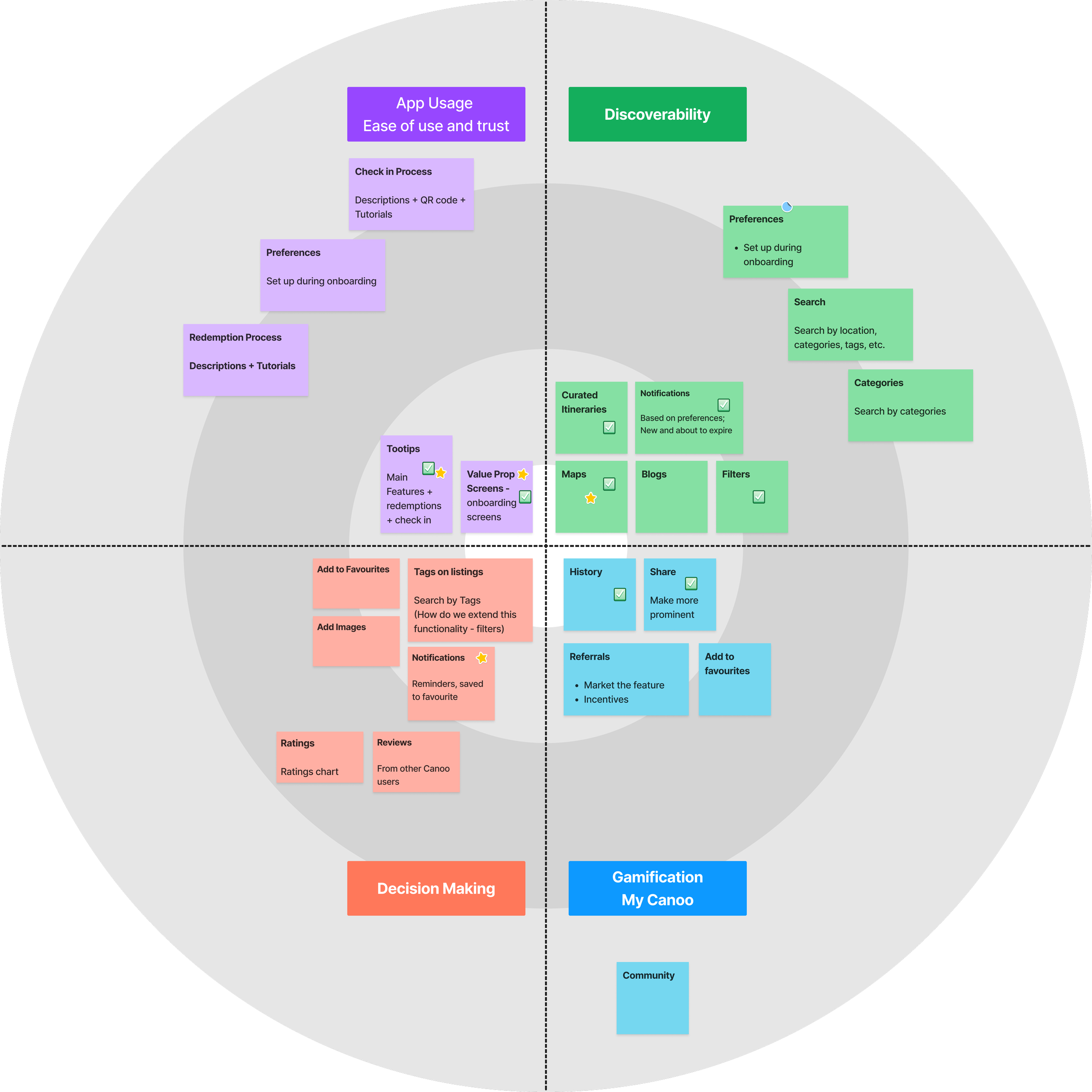
Translating Insights into a Roadmap
Before moving into design, we translated our research findings into a structured product roadmap.
Insights gathered from stakeholder workshops, surveys, and user interviews were synthesized and mapped across key focus areas. This allowed us to identify quick wins, high-impact opportunities, and long-term improvements, ensuring that design decisions were both user-centered and aligned with business priorities.
Rather than addressing problems in isolation, we grouped related insights and visualized them within an improvement framework, helping the team prioritize what to build first and where to invest deeper design efforts.
This roadmap became the foundation for the design phase, guiding how we approached each problem area with clarity and intent.
Final Features- Strategic Redesign based on Research
Map
Enhancing Discovery Through an Interactive Map
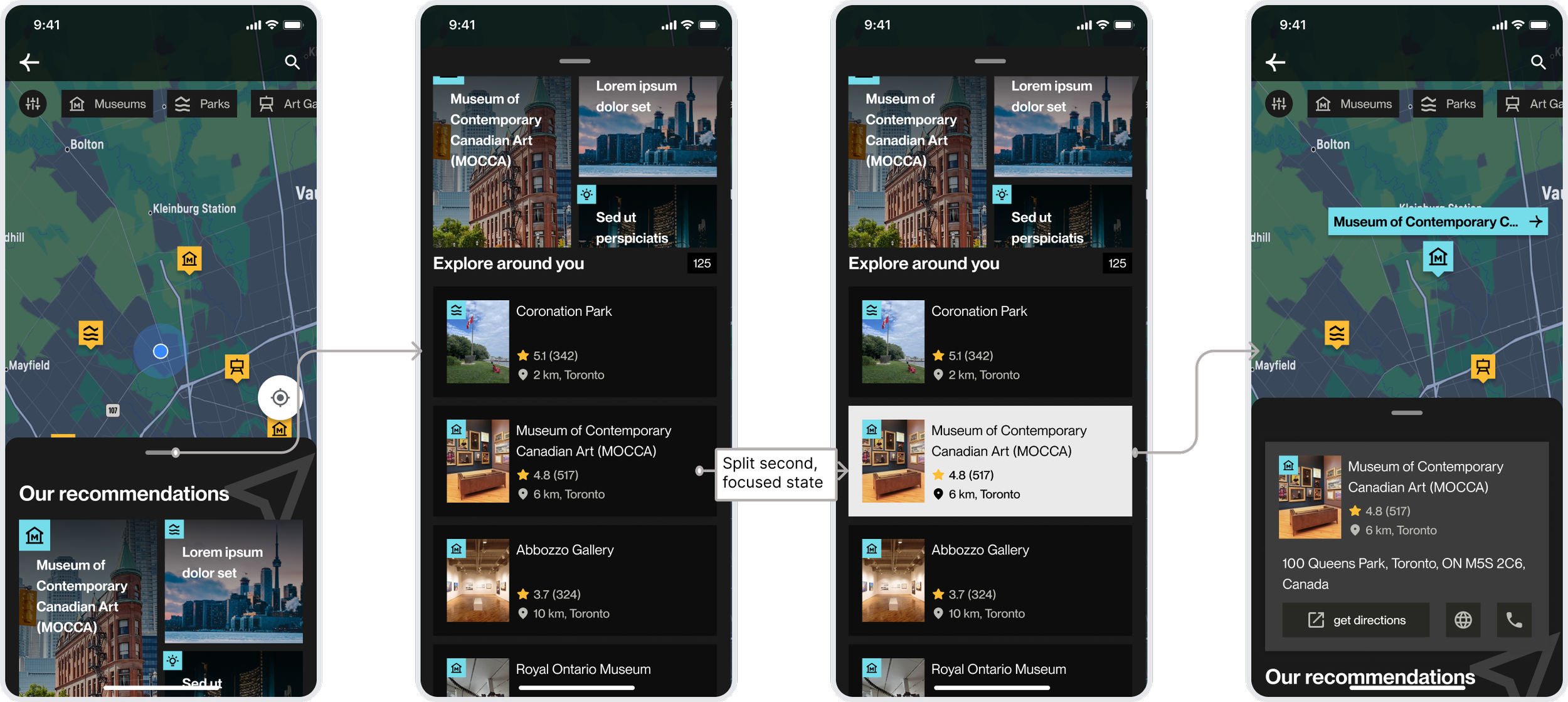
Problem:
The map experience was under utilized due to limited interactivity and unclear navigation. Users struggled to explore nearby attractions, filter categories, or move between locations seamlessly.
Design Approach
We reimagined the map as an interactive discovery surface, supporting both quick exploration and deeper engagement.
Key Improvements
Interactive Map Pins
Users can tap on map pins to reveal contextual preview cards, making exploration more intuitive and responsive.Seamless Detail View
Each preview expands into a detailed page with images and information, allowing users to explore without losing context.Category Filters
Tabs for museums, parks, and other attractions enable quick, interest-based exploration.Localized Discovery
A gallery-style view surfaces nearby recommendations, helping users compare and browse multiple options at once.City-Level Exploration
Expanded views allow users to explore entire cities with curated experiences and potential itineraries.
Outcome: The redesigned map shifts from a static interface to an active discovery tool, enabling users to explore, compare, and plan experiences more fluidly.
Guided Feature Onboarding
Walkthrough of features and reducing discovery friction
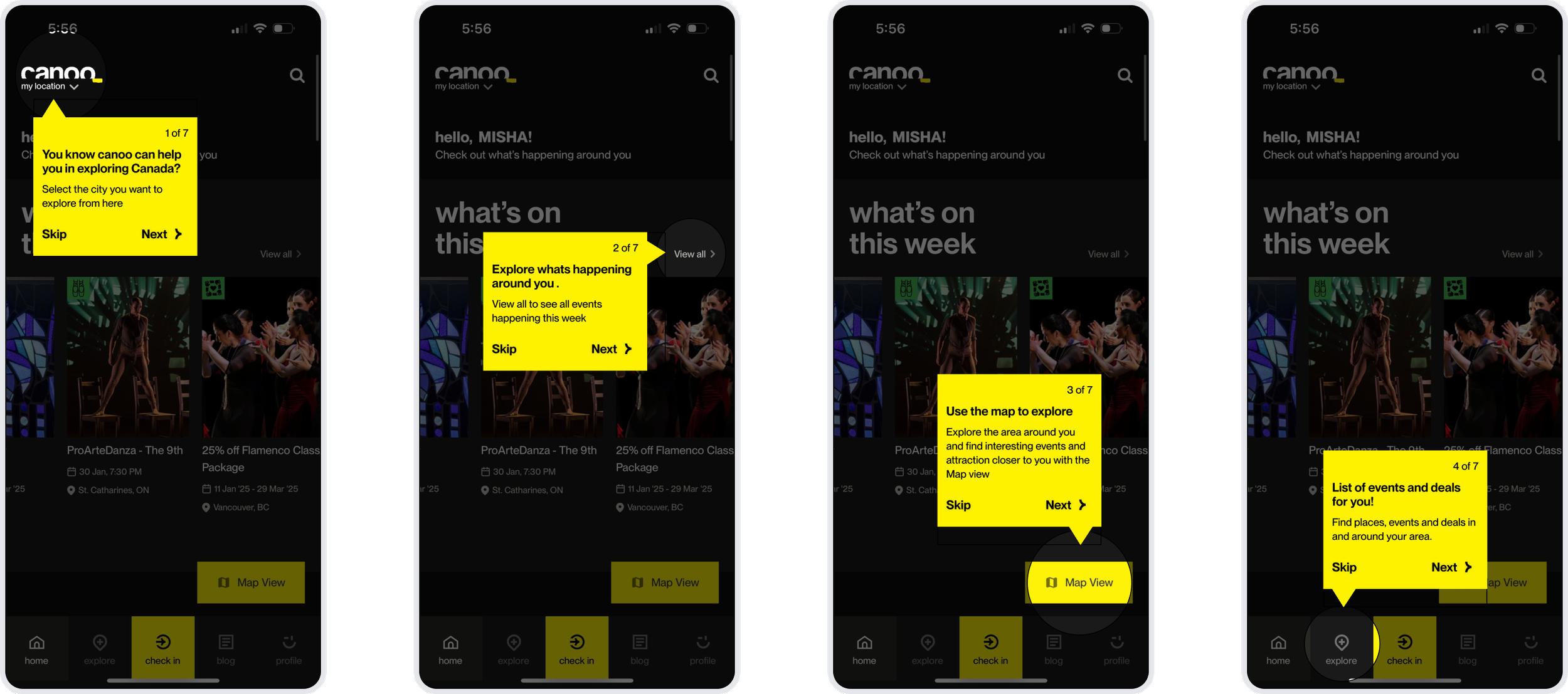
Problem:
During user interviews, a significant pattern emerged: even frequent users were unaware of core functionalities, such as the ability to switch cities or use the map for local exploration. The interface’s depth was unintentionally hiding its value, requiring manual intervention from researchers to help users navigate. This "discovery gap" meant users were missing out on the platform's primary benefits simply because they didn't know they existed.
Design Approach
We implemented an interactive, step-by-step guided tutorial designed to reduce cognitive load for both new and returning users. The strategy was to use "contextual tooltips" that highlight specific UI elements in real-time, transforming the learning process from a passive read into an active walkthrough.
Key Improvements
Progressive Disclosure via Tooltips High-contrast yellow tooltips draw immediate focus to key features, like the city selector and the Map View.
Contextual Spotlight Effect By dimming the rest of the interface and highlighting the active feature (e.g., the "Map View" button), we eliminate visual noise and guide the user's eye exactly where it needs to be.
User-Controlled Pace The inclusion of "Skip" and "Next" options, along with a clear progress indicator (e.g., "1 of 7"), gives users agency over their learning experience, allowing power users to jump straight into the app while supporting those who need more guidance.
Direct Value Messaging Instead of just naming buttons, the tooltips explain the benefit (e.g., "Use the map to explore... interesting events and attractions closer to you"), connecting the feature directly to the user's goal.
Outcome: The onboarding tutorial acts as a bridge between the interface and the user's intent. By proactively surfacing hidden features, we reduced the "time-to-value," ensuring that users can independently discover everything Canoo has to offer without needing a manual or external help.
Profile & Account Settings
Optimizing the Profile architecture
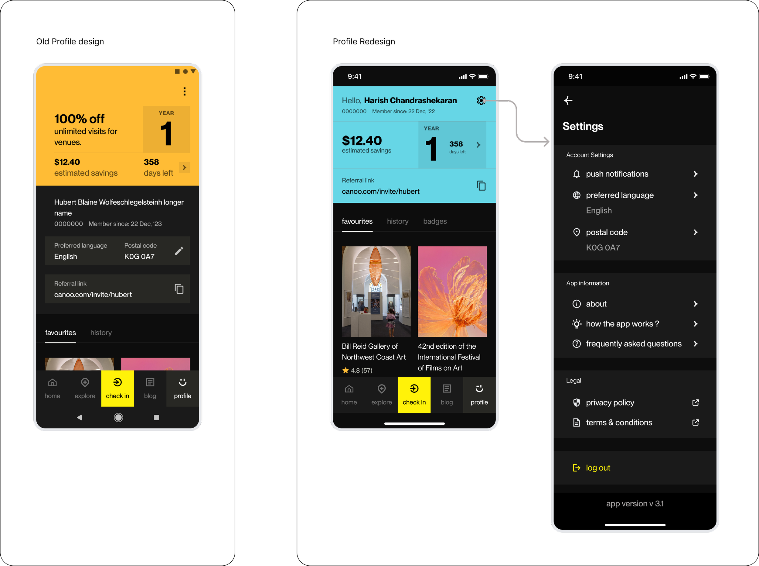
Problem:
The original profile suffered from a flat visual hierarchy . Users were completely unaware of the referral program. as well as the membership structure and its benefits for each year.
Design Approach
We restructured the profile to act as a motivational hub. By offloading administrative data (postal codes, language) to a dedicated settings panel, we cleared space to highlight social growth (referrals) and financial impact (savings).
Key Improvements
Value-First Header & Referral Visibility The referral link was moved to the top of the profile with enhanced styling. By making it a primary element rather than a secondary field.
Tiered Membership Clarity We maximized the visibility of the "Member Year." This helps users immediately identify their current benefit tier and how many days they have left to maximize their rewards.
Gamification & Impact Tracking We prioritized the "Estimated Savings" metric to provide immediate positive reinforcement. The addition of History, Favorites, and Badges transforms the profile from a settings page into a record of the user’s cultural journey and rewards.
Streamlined Settings Hierarchy We restructured settings panel into logical groups (Account, App Info, Legal), making it a comprehensive "control center" that now includes push notifications and tutorials.
Outcome: The redesigned profile successfully shifts the focus from "data management" to "user value." By clarifying the membership timeline and highlighting savings, we’ve created an experience that rewards engagement and makes the app’s most powerful features easily discoverable
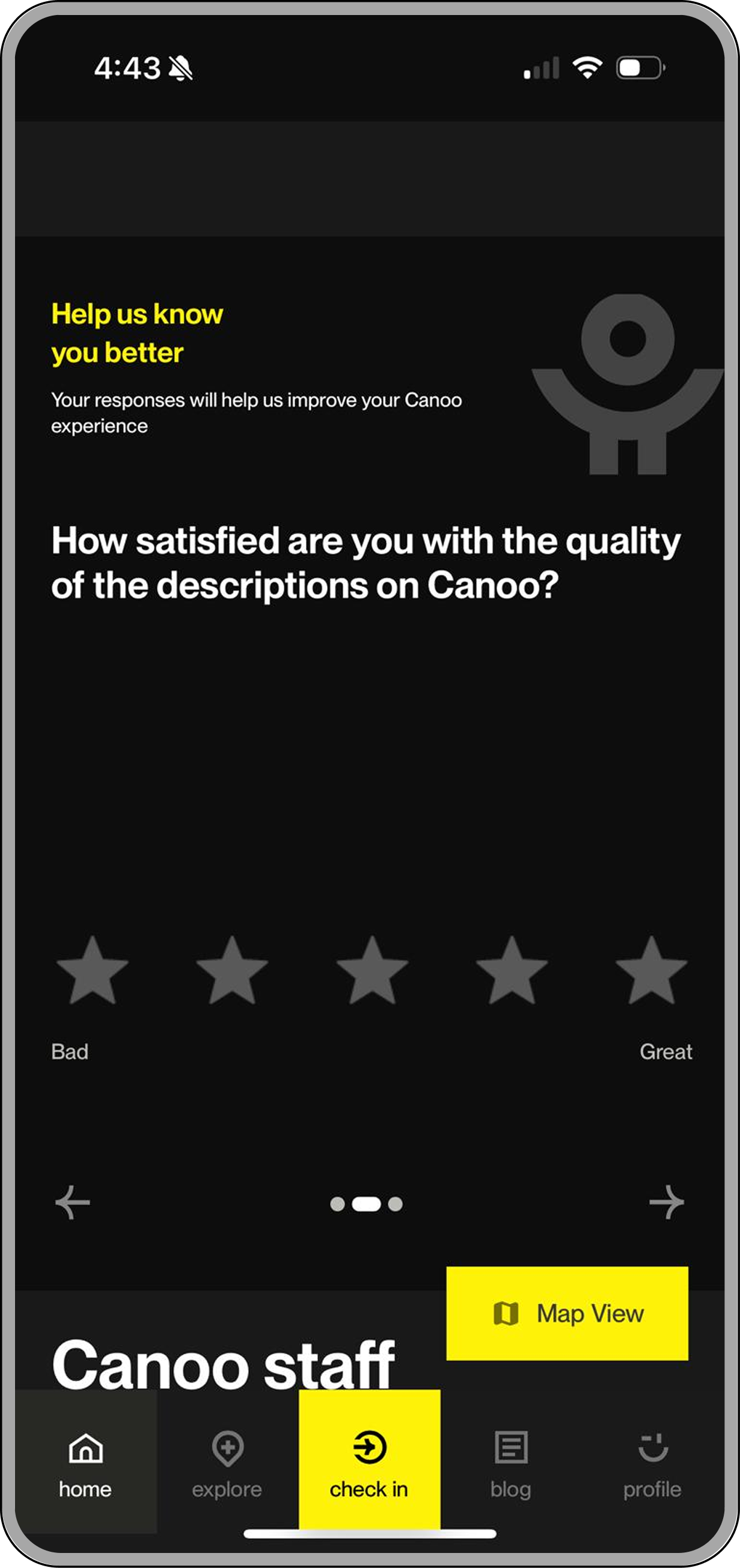
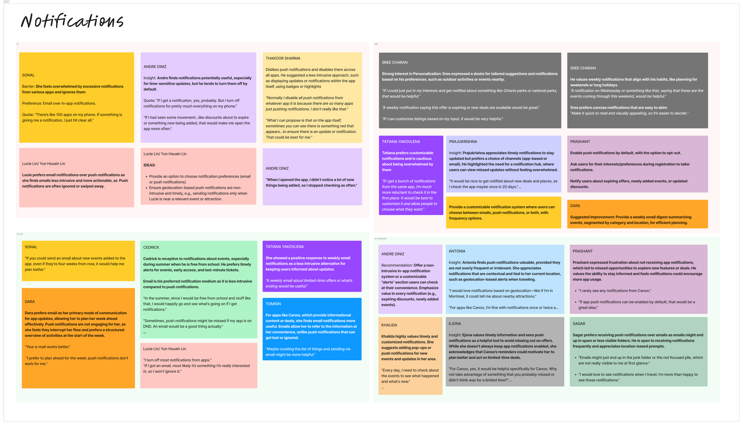
Personalization
Bridging the Gap Between Interest and Action
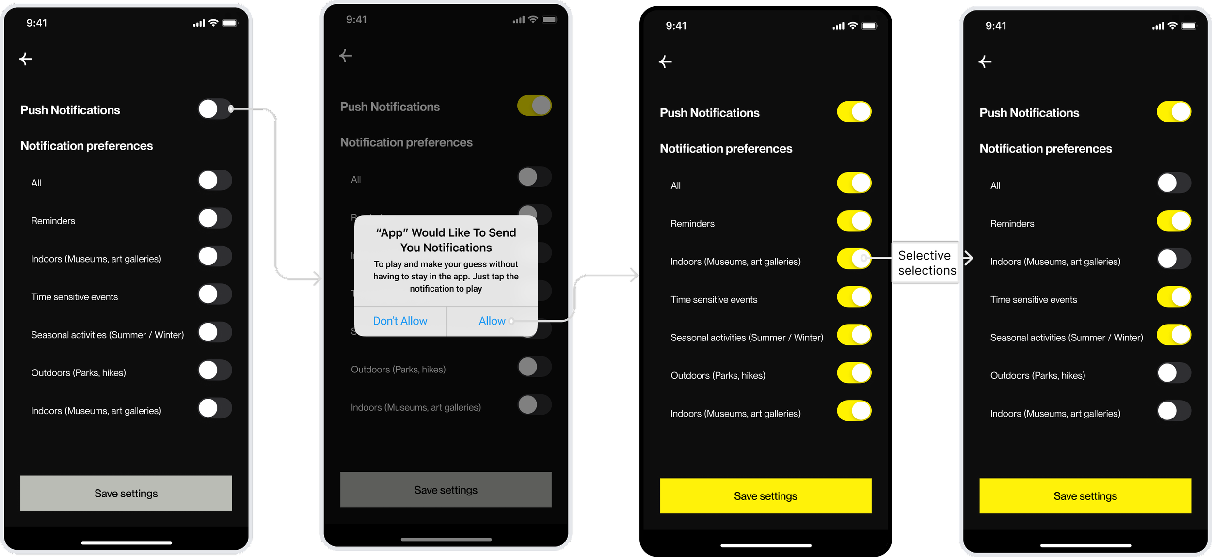
Problem:
Research indicated that users often missed out on relevant cultural events or seasonal activities because they weren’t actively checking the app. A "one-size-fits-all" notification system was also viewed as potentially intrusive, leading users to disable alerts entirely and lose touch with the platform’s value.
Design Approach
We introduced a highly granular notification management system. The goal was to shift from "spammy" alerts to user-controlled value, allowing people to opt-in only to the specific categories - like "Indoors" or "Time-sensitive events", that match their lifestyle.
Key Improvements
Contextual Permission Triggers Instead of asking for permission on the first launch, the prompt is triggered when a user attempts to engage with a feature, explaining exactly why notifications help (e.g., "To play and make your guess...").
Granular Preference Controls Users are empowered with a checklist of specific interests (Reminders, Seasonal, Outdoors, etc.). This ensures that a user interested in hiking isn't bothered by indoor gallery alerts unless they choose to be.
Visual Feedback & System States The UI uses high-contrast "Selective Selections" to show active vs. inactive states clearly. The "Save Settings" button dynamically activates only when changes are made, providing a clear path to completion.
Simplified "All" Toggle A master switch allows users to opt-in or out of everything with one tap, respecting user time and reducing "toggle fatigue."
Outcome: The redesigned notification suite transforms alerts from a technical necessity into a personalized concierge. By giving users total agency over what they hear and when, we increase long-term retention and ensure that Canoo remains a helpful companion rather than a source of digital noise.
Our Impact
From Assumptions to a Research-Led Product Direction
What began as a UX audit evolved into a strategic redesign grounded in research and behavioral insights. Instead of focusing on isolated UI fixes, we redefined how Canoo could better support discovery, engagement, and long-term value for its users.Problem Reframing & Strategic Clarity
Through stakeholder workshops and discovery sessions, we broke down broad business concerns into four core behavioral problems, shifting the focus from surface-level issues to root causes.Validated, High-Confidence Decisions
By combining large-scale surveys with in-depth interviews, we replaced assumptions with evidence-backed insights, enabling confident design decisions across onboarding, discovery, and engagement.Stronger Feature Discoverability
Key features such as the map, city selection, and personalized experiences became easier to find and use, reducing reliance on external guidance and improving independent exploration.Shift from Passive to Active Engagement
The platform evolved from a reactive redemption tool to a more proactive discovery and planning experience, encouraging users to engage earlier and more frequently.Foundation for Future Growth
Beyond immediate design improvements, the project established a research-driven roadmap, helping prioritize future features and ensuring continued alignment with user needs
Project Reflection & Key Takeaways
Designing Beyond Screens
This project reinforced that impactful product design is not just about interfaces, it’s about how well we understand the problem before solving it.
Strong Products Start with Shared Understanding
The stakeholder discovery workshops were critical in aligning business goals with user needs. By breaking down each problem collaboratively through whiteboarding and discussion, we uncovered root challenges that weren’t immediately visible in the initial brief.The Research Funnel Drives Better Decisions
We adopted a layered research approach, starting broad with stakeholder insights and surveys, then narrowing into focused user interviews. This “funnel” helped us move from general patterns to deep behavioral understanding, ensuring every decision was grounded in real user context.Designing Within a Live Ecosystem Requires Balance
Canoo is a live product serving a large and growing newcomer base across Canada. Working within an existing design system meant balancing consistency and innovation, improving usability without disrupting familiar patterns for current users.Research-Led Design is Iterative, Not Linear
This project highlighted that design is an ongoing cycle of learning, testing, and refining. Insights from interviews didn’t just validate ideas, they reshaped them. By continuously iterating based on feedback, we ensured the final solutions were both practical and meaningful.